Wrong CX-version? Click here to get the documentations of all CX-versions.
1. Introduction
Create experiences that delight customers. For marketing, sales, and service: Find, win, retain, and understand customers with BSI CX. Design, execute and optimize perfect customer journeys. Everything is cross-departmental, individualized for every customer, in real time, across all touchpoints, and fully automated – for extraordinary and emotional experiences.
Learn more about all features of BSI CX by visiting our product website.
| You wan’t to build a BSI CX Design? Learn how to use BSI designs by taking part in the e-learning for designs! |
| CX, Customer Experience and Studio. The BSI Customer Suite consists of multiple Products, BSI CX is one of it. Formerly called BSI Studio, CX is an abbreviation of BSI Customer Experience. |
1.1. Getting started
Learn how to use BSI designs by taking part in the e-learning for designs.
The interactive e-learning helps you to reach your goal faster. We have developed this e-learning from years of experience with various customers, with the aim of learning how to work with designs quickly and delivering good results to the customer in a timely manner. In particular, you will learn how to work with our templates so that you don’t have to start from scratch.
We recommend to start by adopting an existing design for BSI CX. This will help you to get started and will already come with existing content elements which act as examples for your customizations. BSI provides a set of design templates that are called Master Templates. The Master Templates for email and web (including landingpage and website) are publicly available on GitHub as an MIT licensed open source project.
Besides, the design build which is used to build the templates, as well as the library for email content elements and web content elements on which the templates are based, are MIT licensed open source projects.
Alternatively, you can start off from scratch by using the Scaffold Design and following the guidance in this documentation to build a completely new template.
1.2. Technical Introduction
This documentation acts as the primary resource for developers that wish to implement a design for BSI CX. Designs are a vital part of BSI CX. While focusing on BSI CX Designs, a basic knowledge of the following layers is necessary:
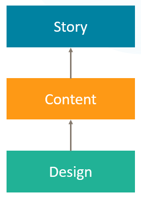
- Story
-
The Story controls the flow of a participant. It offers various steps which can be placed on the storyboard via drag and drop. Your next customer journey delivering a landing page, event invitation, website or newsletter will be born here.
- Content
-
Websites, landing pages and newsletters require rich content. The content editor of BSI CX is here to configure such contents. By user using Content Elements – reusable building blocks that can be placed in your content via drag and drop – you can build attractive newsletters, innovative landing pages and feature rich websites.
- Design
-
The foundation of every Content is its design. The design defines the available „Content Elements“, the visual representation of the content and the behavior of the content and content elements. The Design must be created externally and uploaded into BSI CX. This documentation covers how to build such designs.
1.3. Branding & Visual Design
Each brand has its own and unique visual design language. The branding guidelines of your company or customer define the boundary conditions for building a design. As a design developer for BSI CX, it is your responsibility to get a specification on how the website, landing page or newsletter should look like and what elements it should consist of. Especially when it comes to designing HTML emails, you may have to find a compromise between the developers' ideas of visual design and the actual technical possibilities of HTML emails.
1.4. Constraints
| Our build and the CX-Editor has to be taken "as-is". |
If the Design Validation fails or the Editor doesn’t show the Elements properly, it’s the responsibility of the developer (probably you) to adjust the template accordingly.
There are some web technologies we do NOT support. Two common examples are:
-
Webcomponents might work in the resulting landingpages, but are not supported within the CX editor.
-
Other Frameworks like Angular or React are familiar to most web developers, but not supported by CX.
We strongly recommend you to use our npm build or the CX-Design-Creator. Feel free to contact the design team, if you miss a feature or have an improvement idea.
1.5. File format
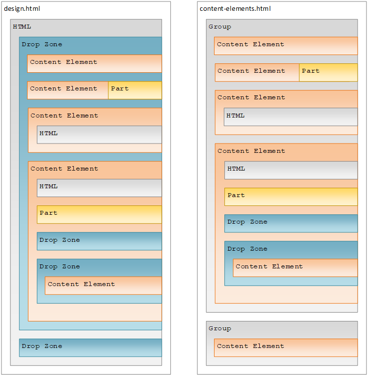
A BSI CX design is stored in a ZIP archive. A valid design for BSI CX must contain the following mandatory files:
- design.html
-
Defines the design, particularly the dropzones the user can use in the BSI CX content editor to place content elements. The exact design.html syntax is described below. This file must be in the root of the ZIP file.
- content-elements.html
-
Defines the individual content elements that can be selected in BSI CX. A content element is a HTML snippet that is inserted into the content using drag & drop. The exact content-elements.html syntax is described below.
- design.properties
-
Contains metadata on the design, such as names and descriptions of the content elements and groups.
Beside these three mandatory files you are free to organize your ZIP file as you want. It is essential though to make sure that the above-mentioned files are placed in the root of the ZIP file. Additional optional files and folders may be supplied in the ZIP file as well. Note that one ZIP file can only contain a single design.
| The files and folders in the ZIP file must not contain any umlauts. |
The following folder structure showcases the content of a simple design:
design.zip
│   content-elements.html (1)
│   design.html (2)
│   design.properties (3)
│
├───css
│       styles.min.css
│
├───img
│       logo.png
│
└───js
        3rd-party.min.js
scripts.min.js| 1 | The content-elements.html file holds all content elements. |
| 2 | The design.html defines the base layout of the page/email. |
| 3 | The design.properties file contains meta information about the design and its elements. |
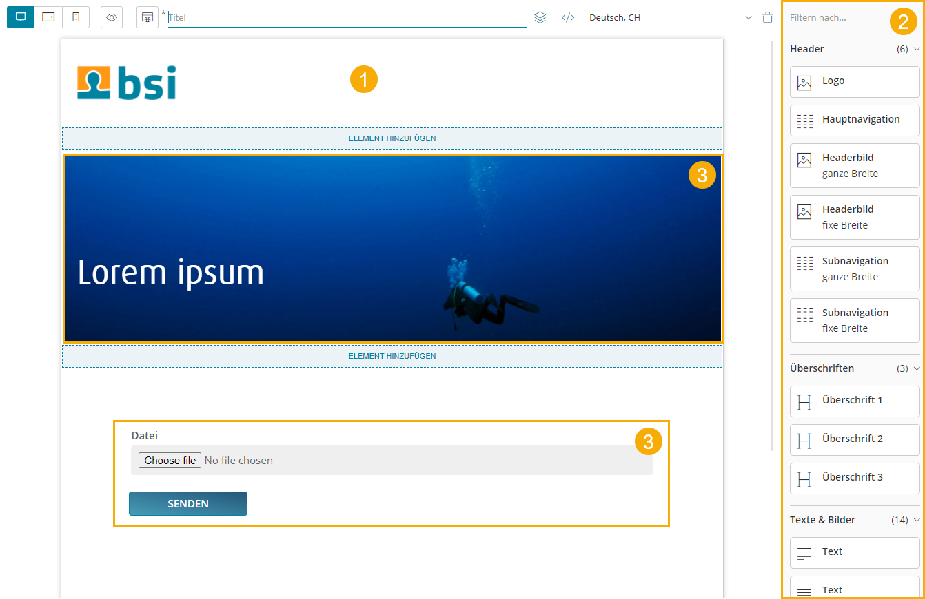
1.6. Content Editor
The content editor is where specific websites, newsletters and landing pages are created. The content creator relies on a design of good quality to build contents which on the other hand are referred from a story.
-
Design preview in content editor
-
List of available content elements
-
Use of a customizable content element
1.7. Structure Reference
The file design.html contains the frame of the design and must include at least one outermost dropzone.
It must contain valid, XHTML conform HTML with Doctype, <html>, <head> and <body> tags.
The file content-elements.html contains all content elements of the design, that can later be drag and dropped into the outermost dropzone of the design.html.
Here no Doctype, <html>, <head> or <body> tags are required.
1.8. Dropzones
While dragging a content element into the content area, you will notice blue lines and blue areas. These areas are called dropzones and identify areas where certain content elements can be placed. Each dropzone has a list of allowed content elements that are specified in the design.
A dropzone is defined by adding the attribute data-bsi-dropzone to an HTML container element (e.g. <div> or <table>).
The list of allowed content elements is specified by the data-bsi-dropzone-allowed-elements attribute.
An optional limit of elements that can be placed inside the dropzone is defined by adding the data-bsi-dropzone-max-number-of-elements attribute.
<div data-bsi-dropzone="preheader-zone" data-bsi-dropzone-allowed-elements="nl-preheader" data-bsi-dropzone-max-number-of-elements="1">
    <!-- Add element -->
</div>| Problems can occour when placing a dropzone into a link or button element. In this case, we recommend using a style. |
1.9. Groups
|
All content elements can be structured in groups.
In the example screenshot on the left side, three groups are defined: |
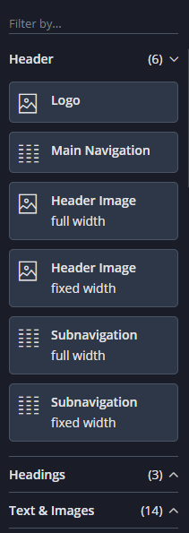
data-bsi-group : HTML<div data-bsi-group="header">
<img data-bsi-element="logo" data-bsi-element-part="image" />
<div data-bsi-element="main-navigation" data-bsi-element-part="html" />
</div>
<div data-bsi-group="headings">
<div data-bsi-element="heading1" data-bsi-element-part="plain-text" />
<div data-bsi-element="heading2" data-bsi-element-part="plain-text" />
</div>
<div data-bsi-group="textAndImages">
<div data-bsi-element="text" data-bsi-element-part="formatted-text" />
<img data-bsi-element="image" data-bsi-element-part="image" />
</div>2. design.properties
2.1. The Basics
Metadata for a design is defined in the design.properties file. It contains general information on the design, such as the name and author, as well as element specific information, such as with which description and icon the elements are to be displayed to the right of the editor.
#metadata example
design.name=My Customer Design
design.author=John Doe, Doe Design Agency
Group information, content element specific entries, configuration capabilities for styles (allowing you to mixin different CSS styles or adding certain features using JavaScript) as well as instructions on how to customize the rich text editor experience can be found in the subsequent chapters.
#metadata
design.name=My Customer Design
design.author=John Doe, Doe Design Agency

#groups
group.buttonsAndLinks.label=Buttons & Links
group.textAndImages.label=Text & Images

#styles
style.background-color.label=Background color
style.background-color.class.bg-color-green.label=Green
style.background-color.class.bg-color-red.label=Red

#rich text editor configurations
html-editor-config.my-config.features=bold,italic,underline,strikeThrough,textColor
html-editor-config.my-config.text-colors=#ff00cc,#aabbcc

#content elements
element.text.label=Text
element.text.icon=text
element.text.parts.formatted-text.label=Formatted text
element.text.parts.formatted-texthtml-editor-config=my-config

element.button.label=Button
element.button.description=A red or green button
element.button.styles=background-color
2.2. Groups
Each content element is assigned to a group. To specify a display name for each group element that exists in the content-elements.html file, add an entry based on the data-bsi-group identifier to the design.properties file.
#Specification
group.<group-identifier>.label=<Name of the group>

#Example
group.textAndImages.label=Text & Images
2.3. Content Elements
For each content element that is defined in the content-elements.html file, the following entries should be defined in order to get a clean user experience. The element identifier is the value of the data-bsi-element attribute:
#Specification
element.<element-identifier>.label=<Name of the content element>
element.<element-identifier>.description=< Description of the content element>
element.<element-identifier>.icon=<icon identifier>
#Example
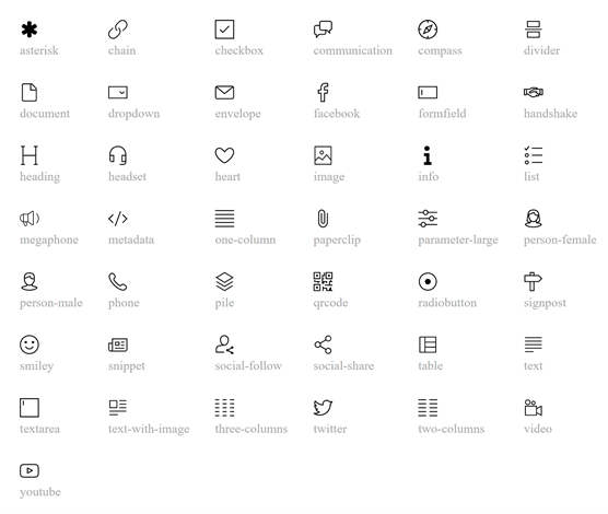
element.logo.label=Cooperate Logo
element.logo.description=Visualize your corporate logo
element.logo.icon=imageRefer to the following illustration to pick a value for icon.
For element parts, labels can be defined. Those are then used as section headings while editing a content element in the content editor. <part-identifier> is the data-bsi-element-part value of the element part.
#Specification
element.<element-identifier>.parts.<part-identifier>.label=<part label>

Usage:
element.logo.parts.image.label=Image for Logo
If one content element has multiple element parts of the same type, an index based notation must be used, following the natural order in the DOM. The index starts at 0 and is only necessary if there are multiple parts of the same type.
element.logo.parts.image[0].label=Desktop image for Logo
element.logo.parts.image[1].label=Mobile image for Logo
2.4. Styles
| We strongly discourage from using styles in email templates. Many email clients still require certain styles to be set through inline styles which does not work well with styles on element level as it is done by the styles feature. |
By defining styles for a certain content element, its characteristics can be controlled. By using styles to make a content element configurable, it is not necessary to implement an additional content element for an almost identical content element. A requirement to implement a button in two different colors (red and green) would therefore be implemented by creating a button content element with two styles: red and green. Styles are only defined once, and each element can have 0 to n style capabilities. Each style capability will then be transformed to a dropdown in the editing dialog of a content element, where the specific style can be applied to a content element.
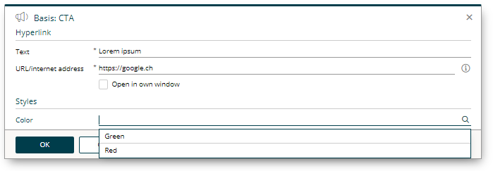
#Specification
style.<style-capability-identifier>.label=<Style capability dropdown label>
style.<style-capability-identifier>.class.<CSS-class-identifier>.label=<Label to describe the dropdown option>

#Example
style.background-color.label=Background color
style.background-color.class.bg-color-green.label=Green
style.background-color.class.bg-color-red.label=Red
1 to n styles can be defined in a comma separated format. Each will then appear as an individual dropdown in the editor, where one style can be selected from the list of styles.
#Specification
element.<element-identifier>.styles=<style-capability-identifier>, <style-capability-identifier>

Usage:
element.button.styles=background-color,border-color,text-color
To ensure that a style is effective, a CSS class must be defined for it. If a style is preselected on an element, it is sufficient to add the desired CSS class to the respective element in the HTML.
.colored-button.bg-color-green { background-color: green; }
.colored-button.bg-color-red { background-color: red; }<button data-bsi-element="button" class="colored-button bg-color-green"></button>2.5. Configuration capabilities of the Rich Text Editor
| CX 1.2.13 |
By defining a content element part of type formatted-text, a fully featured rich text editor will be available to the users of the content editor. The built-in WYSIWYG rich text editor is powered by Froala. BSI allows to customize a subset of Froala features directly out of a design. In order to do so, a configuration section in the design.properties can be used to customize the features of the rich text editor. Each element part of type formatted-text can have it’s own custom list of features, although in most cases one feature definition is shared among different content elements.
A typical, simple rich text editor configuration will look like this:
html-editor-config.my-config.features=bold,italic,underline,strikeThrough,textColor
html-editor-config.my-config.text-colors=#ff00cc,#aabbcc
The above configuration (named my-config) needs to be assigned to a concrete element part in order to apply the customizations:
element.text.parts.formatted-text.html-editor-config=my-config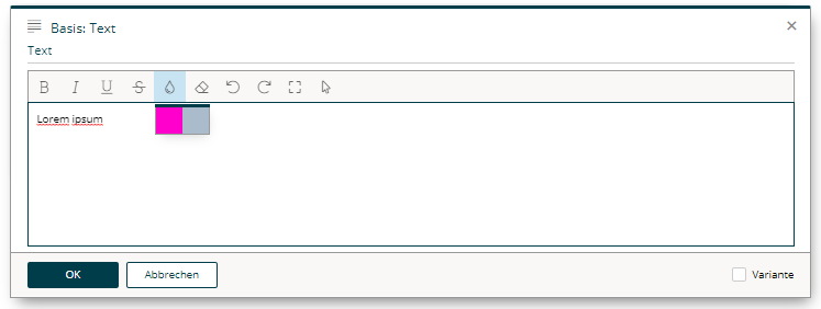
The entire list of supported configuration options is documented in the subsequent chapters.
2.5.1. Feature list
The most important configuration option is the list of features that will be shown in the WYSIWYG editor.
The format is as follows:
html-editor-config.<config identifier>.features=<comma separated feature list>If one wants to support bold, italic, and underlined text, the definition for doing so would be like this:
html-editor-config.my-config.features=bold,italic,underlineThe keys in the list below (indicated in bold) must be provided as a comma separated list as in the example above. Each key identifies a certain feature which is then displayed as a separate button in the editor. The sequence is irrelevant and does not affect the display order, as the display order is given by the server-side implementation.
The following features are available:
| bold |
the text can be formatted in bold. |
| italic |
the text can be formatted in italics. |
| underline |
the text can be underlined. |
| strikeThrough |
the text can be displayed with a line through the center. |
| subscript |
the text can be displayed as a subscript. |
| superscript |
the text can be displayed as a superscript. |
| fontSize |
the font size can be changed based on the font-sizes value list. |
| lineHeight |
the line height can be changed based on the line-heights value list. |
| textColor |
the text color can be changed based on the text-colors value list. |
| backgroundColor |
the background color can be changed based on the background-colors value list. |
| alignLeft |
the text can be left aligned. |
| alignCenter |
the text can be centered. |
| alignRight |
the text can be right aligned. |
| alignJustify |
the text can be justified (As most browsers are terrible in handling justified text properly, we recommend to not enable this feature). |
| formatOL |
the text can be displayed as an organized list. |
| formatUL |
the text can be displayed as an unorganized list. |
| outdent |
the text can be outdented (useful for sub-lists). |
| indent |
the text can be indented (useful for sub-lists). |
| paragraphFormat |
changes the format of the paragraph based on the formats value list. |
| quote |
display the text as a quote. |
| specialCharacters |
inserts special characters. |
| emoticons |
inserts emoji. |
| insertLink |
permits the immediate insertion of links without having to use a wildcard. |
| html |
displays and edit the HTML of the text. |
| help |
displays Help. |
In addition, the following features are always displayed in the editor and must therefore not be listed separately:
| clearFormatting |
clears all formatting from the selected text. |
| undo |
undoes the change. |
| redo |
redoes the change. |
| fullscreen |
displays the editor in full screen mode. |
| selectAll |
selects the entire text in the editor. |
Our experience has shown that these features are useful in the vast majority of cases and that the editing experience would be significantly affected without them.
2.5.2. Value Lists
A list of values that will be shown in the editor can be defined for certain features (e.g. the list of colors when the font color feature is active).
html-editor-config.my-extended-config.features=bold,italic,underline,strikeThrough,textColor,backgroundColor,fontSize,paragraphFormat,lineHeight
html-editor-config.my-extended-config.text-colors=#ff0000,#00ff00,#0000ff
html-editor-config.my-extended-config.background-colors=#ff0000,#00ff00,#0000ff
html-editor-config.my-extended-config.formats=h1,h2,h3,h4,pre
html-editor-config.my-extended-config.font-sizes=8,9,10,11,12,14,16,18,24,30,36,48,72
html-editor-config.my-extended-config.font-size-unit=px
html-editor-config.my-extended-config.font-size-default=12
html-editor-config.my-extended-config.line-heights=1,1.15,1.5,2
html-editor-config.my-extended-config.enter=p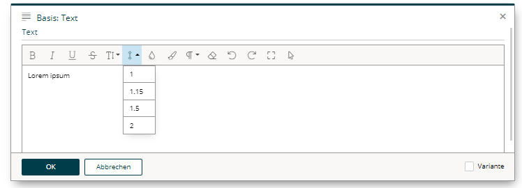
2.5.2.1. Colors
A comma separated list of RGB colors in hexadecimal format.
To customize the color picker for textColor and backgroundColor, provide a list of colors through the text-colors and background-colors value list.
html-editor-config.my-config.text-colors=#ff00cc,#aabbcchtml-editor-config.my-config.background-colors=#dddddd,#abcdef2.5.2.2. Paragraph formats
| CX 1.2.46 |
Paragraph formatting and headings can be configured as well. This may be customized through the formats value list, which will only have an effect if the feature paragraphFormat is active.
html-editor-config.my-config.formats=p,h1,h3The following formats can be provided:
| p |
for an html paragraph ( |
| h1 |
for an html H1 title ( |
| h2 |
|
| h3 |
|
| h4 |
|
| h5 |
|
| h6 |
|
| pre |
for preformatted text ( |
2.5.2.3. Line heights
To customize the lineHeight value list, provide a list of heights in percentages, comma separated. The line height values define the factor by which factor the current line height is multiplied based on the font size used.
html-editor-config.my-config.line-heights=1,1.15,1.5,22.5.2.4. Font size
To customize the list of font sizes for fontSize, provide a list of sizes through the font-sizes value list. A custom default value can be set by using font-size-default.
Size information is provided numerically. If several sizes are permitted, then each individual entry is listed in a comma separated format. The data on font sizes (font size and font size default) are absolute values.
The unit of measurement (font-size-unit) defines which unit to be used for information regarding the font sizes. The following are permitted:
| px |
Pixels |
| em |
Relative to font size of the parent |
| rem |
Relative to font size of the root element |
| pt |
Points |
| cm |
Centimeters |
| mm |
Millimeters |
html-editor-config.my-config.font-sizes=8,9,10,11,12,14,16,18,24,30,36,48,72
html-editor-config.my-config.font-size-unit=px
html-editor-config.my-config.font-size-default=12
2.5.2.5. Entry mode
By defining the entry mode (enter), you define what happens in the editor when the Enter key on your keyboard is pressed. The following options are available:
| p |
to enclose the text with a paragraph ( |
| div |
to enclose the text with a |
| br |
to simply insert a |
In p and div modes, there is the option to force a simple line break with Shift+Enter. This will add <br> without immediately ending the block and starting a new one.
html-editor-config.my-config.enter=div3. Content Editor
3.1. Content editor specific CSS
| CX 1.2.46 |
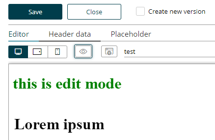
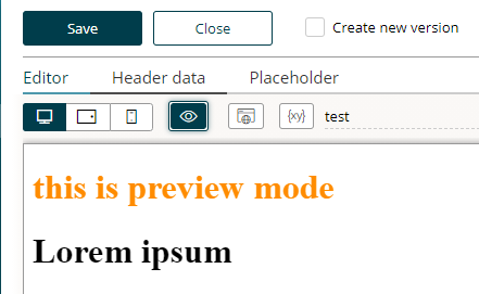
Sometimes it is useful to apply special CSS rules to the content when the page is in edit or preview mode. There are two special CSS classes set on the document’s <html> tag to address such use cases:
-
bsi-ce-edit-mode is set when the document is shown in the content editor.
-
bsi-ce-preview-mode is set when the document is shown in preview mode inside the content editor.
The preview mode outside the content editor or any content that is delivered by a story will not have any of the above listed classes.
<html><head><!-- head omitted --></head>
<body>
    <h1 class="hide show-if-edit">this is edit mode</h1>
    <h1 class="hide show-if-preview">this is preview mode</h1>
    <!-- rest of body omitted -->
</body>.hide { display: none; }
.bsi-ce-edit-mode .show-if-edit { display: block; color:green; }
.bsi-ce-preview-mode .show-if-preview { display: block; color:darkorange; }| Edit mode | Preview Mode |
|---|---|
|
|
3.2. Predefined Story outlets (Bracket Links)
One way to define a link out of a design is to use a data-bsi-element-part="link" annotation on a link (<a>) element.
Doing so will add a link editor to enter a URL and a link text to the content editor.
<a data-bsi-element-part="link" href="https://www.bsi-software.com/">BSI Website</a>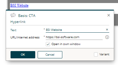
Another way to define a link directly out of a design is by using the CX bracket link syntax for links. This mechanism in built into the content editor itself to create a link anywhere in a text.
<span data-bsi-element-part="plain-text" >If you do not wish to receive further promotions, you can [unsubscribe] now.</span>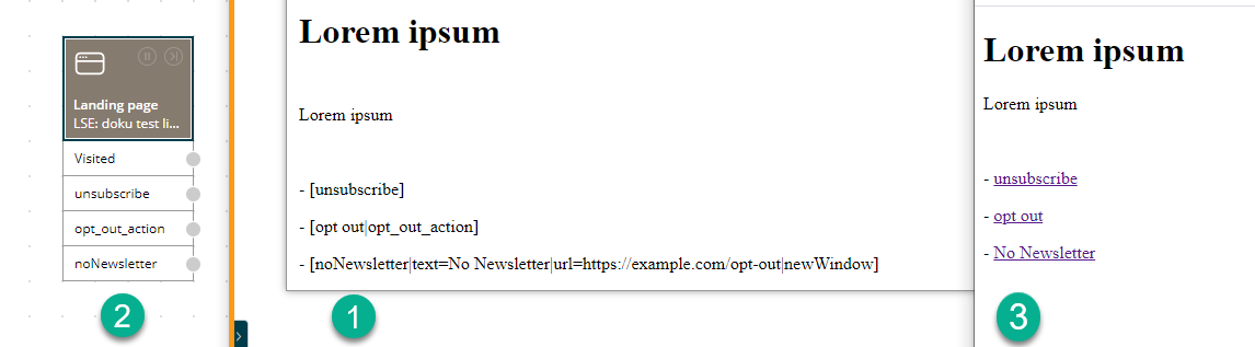
| 1 | Definition of links using the CX bracket syntax. |
| 2 | Each link is converted into a story outlet. Each outlet can then be linked to an individual action in the story. |
| 3 | The content that is delivered to the user. |
While rendering the above content, CX will convert the [unsubscribe] term to a link tag internally, create a unique hyperlink and will add a new outlet to the step to which the current content belongs.
When using bracket links, the story designer will see the provided link as a story outlet by default.
This allows the Story Designer to link the click action on the link with other steps (e.g. a subsequent landing page step).
In the example above, the Email Step will already have an outlet named unsubscribe.
The bracket technique itself is usable everywhere in the content editor and is not limited to the usage in a design.
The convenience format of a bracket link for CX is [link text|ID].
The full syntax is [ID|text=link text|url=https://example.com|newWindow].
-
urlcan be used to explicitly specify an absolute URL. -
newWindowwill force to open the target in a new tab or window.
Both url and newWindow are optional.
If a bracket itself should be part of a link, it can be escaped with a backslash (e.g. [\[click me\]|id] will then be visualized as [click me]).
You can also place a bracket link anywhere in the design.
An example of doing so is to add it to an href of a link.
<a href="[Facebook]"><img src="img/facebook.png" /></a>| Be reminded that all CX will replace everything that looks like a bracket link. It is your responsibility as a developer to use escaping where brackets have a different meaning. |
<!-- CX will convert this to a bracket link -->
<input pattern="[0-9]">

<!-- escaping is mandatory for the pattern mechanism to work as desired -->
<input pattern="\[0-9]">
3.2.1. Using anchor links inside a design
First of all, it is possible to use anchor links in the form of #top inside a CX design.
Anchor links are allowed as targets of link parts.
However, it is not possible to use anchor links as url of a bracket link.
This is due to the fact, that bracket links meant to be trackable by CX and this requires a complete roundtrip to the server.
<section id="news">
    <!-- some news -->
</section>

<!-- some more html code -->

<div data-bsi-element="cta">
    <a href="#news" data-bsi-element-part="link">Jump to news</a>
</div>
3.3. Content Elements and Parts
This chapter describes the structure of the content-elements.html file and the available content elements.
The content-elements.html file contains HTML snippets for the content elements that can be selected in BSI CX.
To do so, BSI CX searches for elements with the data-bsi-element attribute in the HTML code.
The recommendation is to define all content elements at the same level as the DOM, for example, as <div> directly below the <body> element.
However, for better visualization during development, the developer can also create additional elements (e.g., with CSS borders or margins) around the elements marked with data-bsi-element.
BSI CX will ignore those, though.
It is not necessary for the content-elements.html file to have a <html>, <head> or <body> tag.
But the containing HTML must be valid.
|
The following listing illustrates a very simple content element:
<div data-bsi-element="logo">
    <img src="logo.png" alt="My Company"/>
</div>
As we can see in the listing, data-bsi-element defines the identifier of the content element.
It must not contain any spaces.
The identifier corresponds to the value that can be used in the attribute called data-bsi-dropzone-allowed-elements in the dropzone.
The element marked with the identifier, when used, is inserted into the relevant dropzone (not only the child elements).
| The content editor specifically highlights the content elements. To make sure this works properly, all content elements must be block elements rather than inline elements. |
A content element can define one or more internal dropzones.
The definition is the same as for design.html.
For example, use it with a content element for a 3-column layout with three internal dropzones.
While the dropzones may be nested arbitrarily, please pay attention to usability.
3.3.1. Grouping
Complex designs can consist of many elements.
For better organization, it is mandatory to group the elements.
To do so, the data-bsi-group attribute can be used.
The following listing illustrates such a grouping:
<div data-bsi-group="texts">
    <div data-bsi-element="default-text" data-bsi-element-part="formatted-text">
        <p>Lorem ipsum</p>
        <ul>
            <li>lorem</li>
            <li>ipsum</li>
        </ul>
    </div>
    <div data-bsi-element="raw-text" data-bsi-element-part="plain-text">Lorem ipsum</div>
</div>
<div data-bsi-group="images">
    <div data-bsi-element="full-size-image">
        <img src="example.jpg" data-bsi-element-part="image"/>
    </div>
</div>
3.3.2. Parts
A content element part references, inside a content element, an area (such as text or image) that can be edited directly with the BSI CX content editor.
The content element "text with image" knows, for example, the two areas image and plain-text.
The identifiers must be adopted exactly as they are.
The following listing illustrates the example:
<figure class="element text-with-image" data-bsi-element="text-with-image"> (1)
    <img class="image" data-bsi-element-part="image" src="example.jpg"/> (2)
    <figcaption class="text" data-bsi-element-part="plain-text">Lorem ipsum</figcaption> (3)
</figure>| 1 | This is the content element definition. |
| 2 | The image part defines an editable image. |
| 3 | The plain-text part defines an editable plain text. |
The individual parts are likely to contain sample content already.
This content must fit in terms of the structure (e.g., only plain text with plain-text, and a correct table definition with table, etc.)
|
3.3.2.1. Plain Text
The part plain-text can be applied to any HTML element that can contain text.
The text is inserted within the element.
The element must not have children with other content element parts (content is removed).
A single-line text field without formatting is available as the editor.
When using the optional attribute data-bsi-multiline, the text field becomes multiline.
Boolean attributes like data-bsi-multiline require an empty value ="" or sample value like ="true".
|
<h1 data-bsi-element="title-h1" data-bsi-element-part="plain-text" class="element title-h1">Lorem ipsum</h1><p data-bsi-element="paragraph" data-bsi-element-part="plain-text" data-bsi-multiline="">Lorem ipsum<br>dolor sit amet</p>3.3.2.2. Formatted Text
The part formatted-text can be applied to any HTML element that can contain text.
The element must not have children with other content element parts (content is removed).
The rich text field with a limited number of formatting options is available as an editor.
For more information about the available configuration options see chapter Configuration capabilities of the Rich Text Editor.
<section data-bsi-element="section" data-bsi-element-part="formatted-text">
    <h1>Lorem ipsum dolor sit amet</h1>
    <p>Proin porta <strong>pharetra est non</strong> molestie.</p>
    <p><a href="https://www.example.org/">More</a></p>
</section>
3.3.2.3. HTML
The html part can be applied to any HTML element.
The code is inserted within the element.
The element must not have children with other content element parts (content is removed).
A text field is used as the editor.
HTML can be written directly into this field.
<div data-bsi-element="html" data-bsi-element-part="html">
    <iframe src="https://www.openstreetmap.org/export/embed.html" style="height: 500px;"></iframe>
</div>
This part can be useful for:
-
Prototyping
-
Quick-and-Dirty Hacks
-
Embedding any HTML code
It is not allowed to place any data-bsi-element or data-bsi-element-part attributes inside the HTML code.
This won’t work as expected and leads to invalid content.
|
3.3.2.4. Video
The video part can be applied to any block level HTML element.
This part can be used to display information and thumbnails of external videos.
It can also be used to embed external videos.
Within the element, various elements can be used as placeholders:
-
Each
<iframe>element is used to embed an external video player. -
Each
<img>element with adata-bsi-video-thumbnailattribute is used to display the video thumbnail. -
Each HTML element with the
data-bsi-video-titleattribute is used to display the video title. -
Each HTML element with the
data-bsi-video-descriptionis used to display the video description. -
Each
<a>element with thedata-bsi-video-linkis used to place a link to the external video. The text of the hyperlink will not be touched, only thehrefattribute will be filled.
| Fetching the video’s title and description may requires an active API key for the appropriate provider. |
Boolean attributes like data-bsi-video-title require an empty value ="" or sample value like ="true".
|
The following external video providers are supported:
- YouTube
-
Without a configured API key, only the thumbnails are automatically picked. More information on obtaining a YouTube API key: https://developers.google.com/youtube/v3/getting-started
Be aware that there are two kinds of URLs involved:
One is the link to the video platform itself for the href attribute on the <a> tag and there is the embedded URL for the <iframe> player.
In the case of YouTube https://www.youtube.com/watch?v=YpnFs4aBLQA is the link to the video platform.
The corresponding embedded URL would be https://www.youtube.com/embed/YpnFs4aBLQA.
If you want to provide sample content for your element you may have to fill both URLs in the right tag.
The following listing illustrates the use of sample content for a simple video element:
<div class="element video" data-bsi-element="video-simple">
    <div class="responsive-video" data-bsi-element-part="video" data-bsi-video-data-link="https://www.youtube.com/watch?v=YpnFs4aBLQA"> (1)
        <iframe width="1120" height="630" frameborder="0" src="https://www.youtube.com/embed/YpnFs4aBLQA" allow="autoplay; encrypted-media" webkitallowfullscreen mozallowfullscreen allowfullscreen></iframe> (2)
    </div>
</div>| 1 | The link to the video platform is placed inside the data-bsi-video-data-link attribute. |
| 2 | The embed video URL is placed inside the src attribute of the <iframe> tag. |
This results in the following content element:

A more complex video element would be the following:
<div class="element video" data-bsi-element="video-thumbnail">
<div class="video-thumbnail" data-bsi-element-part="video" data-bsi-video-data-link="https://www.youtube.com/watch?v=YpnFs4aBLQA"> (1)
<p>
<a href="https://www.youtube.com/watch?v=YpnFs4aBLQA" data-bsi-video-link="" target="_blank"> (2)
<img src="https://i.ytimg.com/vi/YpnFs4aBLQA/maxresdefault.jpg" alt="" data-bsi-video-thumbnail=""/> (3)
</a>
</p>
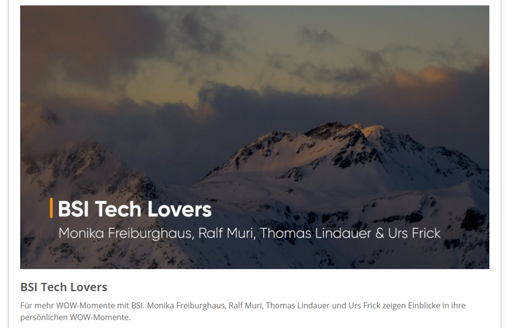
<h3 data-bsi-video-title="">BSI Tech Lovers</h3> (4)
<p data-bsi-video-description="">Für mehr WOW-Momente mit BSI. Monika Freiburghaus, Ralf Muri, Thomas Lindauer und Urs Frick zeigen Einblicke in ihre persönlichen WOW-Momente.</p> (5)
</div>
</div>| 1 | The link to the video platform is placed inside the data-bsi-video-data-link attribute. |
| 2 | The link to the video platform is also placed inside the href attribute. |
| 3 | The placeholder image can also be part of the design, it is not mandatory to provide the URL to the real image here. |
| 4 | The content of the first tag marked with data-bsi-video-title will be used as placeholder for the title. |
| 5 | The content of the first tag marked with data-bsi-video-description will be used as placeholder for the video description. |
This results in the following content element:
The video part is quite powerful and can be used in various ways:
-
Enrich your landing page or website with embedded videos.
-
Use video thumbnails in your content.
-
Send emails with link, thumbnail, title and description of an external video.
3.3.2.5. Image
The image element part can only be placed inside of a <img> or <a> tag.
The source is inserted in the src attribute.
<div data-bsi-element="image-simple">
    <img src="example.jpg" alt="Example image" data-bsi-element-part="image" />
</div>
It is not possible to omit the image of an image part.
Therefore it is mandatory to specify an image in the content editor.
Otherwise a validation error will occur.
srcset
By specifying the srcset attribute, the images are also scaled accordingly.
If a srcset attribute is present, the src attribute is set to the image at its highest resolution (according to the defined srcset).
If there is no srcset attribute, the selected image is not scaled and is placed directly as src.
For images with dynamic sources (the image is set through the story), the definition of the srcset is ignored.
If you set an image in the content editor, make sure it is of decent size. After saving the content, the image is scaled to the sizes specified in the srcset attribute and stored on the CX resource server. Depending on the resolution of device that is requesting the landing page/website, a different resolution of the image is loaded.
We highly recommend to set the srcset attribute.
|
<div data-bsi-element="image-simple">
    <img src="example-800w.jpg" srcset="example-480w.jpg 480w, example-800w.jpg 800w" alt="Example image" data-bsi-element-part="image" />
</div>3.3.2.6. background-image
An arbitrary element which permits the use of a CSS background-image.
It places the CSS attribute background-image.
The image selection is available as the editor just like with the image part.
<div class="element scene" data-bsi-element="scene">
    <div data-bsi-element-part="background-image" style="background-image: url('example.jpg')"></div>
</div>
3.3.2.7. table
A <div> oder <td> element with a table element as a direct child element.
The table content is filled according to the editor (including colgroup).
Colspan is not supported. On even or odd rows or columns, the CSS class even or odd is placed.
The <th> tag is used for header columns, if specified.
This part does not support <thead> and <tbody> tags.
| It is possible to use an iterator to generate dynamic tables. |
<div class="element table" data-bsi-element="simple-table" data-bsi-element-part="table">
    <table>
        <tr>
            <th>Firstname</th>
            <th>Lastname</th>
            <th>Age</th>
        </tr>
        <tr>
            <td>John</td>
            <td>Doe</td>
            <td>42</td>
        </tr>
    </table>
</div>
3.3.2.8. iterator
An arbitrary element.
The attribute data-bsi-iterator can be defined on this element.
The attribute data-bsi-iterator-item must be defined on the element or on one of the included elements.
This defines the element to be duplicated.
If data-bsi-iterator is defined and the iterator does not provide any data, the entire element is removed.
Otherwise, only the element to be duplicated is marked with data-bsi-iterator-item.
Boolean attributes like data-bsi-iterator-item require an empty value ="" or sample value like ="true".
|
A text field is used as the editor. The name of the iterator can be placed in this text field.
<div class="element iterator" data-bsi-element="iterator" data-bsi-iterator="sample">
    <div class="customer" data-bsi-iterator-item="">
        <dl>
            <dt>Name</dt>
            <dd>{customer.name}</dd>
            <dt>Address</dt>
            <dd>{customer.address}</dd>
        </dl>
    </div>
</div>
3.3.2.9. news-snippets
An arbitrary element.
Displays a news item.
Within the element, elements with the data-bsi-property attribute can be defined.
This attribute may have the following values: image, title, headline, or text.
The content of these elements is then replaced accordingly with the value of the selected news item.
In that context, elements from property title, headline, and text are mandatory.
If a link in CX is configured into a news snippet, title and image are automatically supplemented with a link.
When generating the news list, the following CSS classes are automatically set on a news snippet to permit better styling of the individual elements:
| news-nth-X |
the position in the list. E.g., |
| odd |
odd position in the list |
| even |
even position in the list |
| first |
first news snippet |
| last |
last news snippet |
<div class="element news" data-bsi-element="news-snippets" data-bsi-element-part="news-snippets">
    <div class="news-image element">
        <img class="ns-image" src="placeholder.jpg" data-bsi-property="image"/>
    </div>
    <div class="news-text element">
        <h2 class="ns-title" data-bsi-property="title">Breaking News</h2>
        <p class="ns-headline" data-bsi-property="headline">Lorem ipsum dolor sit amet</p>
        <p class="ns-text" data-bsi-property="text">Ea vis odio voluptua, pri ei facer denique.</p>
    </div>
</div>
3.3.2.10. form
A <form> element.
The element must contain a submit button and may also contain a reset button.
Those buttons must be <input> elements.
In the form configuration, the reset button can be hidden or displayed.
In that case, the DOM attribute disabled is set on the input element.
The form element must contain an element with the data-bsi-form-validation attribute, and this attribute must contain an element with the data-bsi-form-validation-item attribute.
Within the element with data-bsi-form-validation, the element with data-bsi-form-validation-item is duplicated for each error in the server-side form validation, and the validation message is inserted as the content of the validation item element.
Boolean attributes like data-bsi-form-validation require an empty value ="" or sample value like ="true".
|
In addition to the display in the above-described element, a data-bsi-form-validation-message attribute is set for each defective form field.
It contains the validation error for the respective field.
The attribute can be used to style the field with CSS if there is an error (CSS selector checks for the presence of the attribute) or to display the error message with CSS and/or JavaScript in the respective field.
The following form fields can be marked as mandatory fields in the content editor.
If this is done, the required attribute is set in the relevant HTML element.
Thus, the mandatory elements are styled using the respective CSS selectors.
To exclude a certain form from CX you set the data-bsi-form-ignore attribute on the form tag.
Any form with this marker will be left untouched by CX.
<div class="element form" data-bsi-element="slim-form">
    <form class="form form-wrapper" data-bsi-element-part="form" id="form">
        <ul class="form-validation" data-bsi-form-validation="">
            <li class="form-validation-item" data-bsi-form-validation-item=""></li>
        </ul>
        <div class="form-content" data-bsi-dropzone="form-content" data-bsi-dropzone-allowed-elements="form-field">
        </div>
        <div class="form-button-bar">
            <input type="submit" class="form-button send" value="Senden" />
            <input type="reset" class="form-button reset" value="Zurücksetzen" />
        </div>
    </form>
</div>
3.3.2.11. form-field
A <div> element.
Contains a <label> and an <input> element.
In the configuration, the label, initial value, mandatory field, and input type can be defined.
The following input types are supported:
| text |
For a simple text field. |
|
Input field, that accepts a valid e-mail address. |
|
| tel |
Input field, that accepts a phone number. |
| password |
A password input field, that shows |
| number |
An input field, that accepts only numbers. |
| range |
An input field, that shows a numeric range slider. |
| date |
An input field, that can be used to select a certain date. |
| datetime-local |
Input field, that accepts a date and a specific time. |
| time |
Input field, that accepts a time. |
| file |
Input field, that can be used to upload a file. |
To fixate the form field type, the data-bsi-form-field-fixed-type attribute can be used on the element.
Doing so allows the setup of a customized date field, for example.
The type of the form field is then set and cannot be changed in the content editor.
| Be aware, that not all browsers support all types of input fields. Some browsers require a polyfill to handle certain types of form fields. It is up to the developer to use polyfills where this is required. |
<div class="form-field" data-bsi-element="date-field" data-bsi-element-part="form-field" data-bsi-form-field-fixed-type="">
    <label for="date" class="label">Date</label>
    <input id="date" class="input" type="date" value="2009-11-13" required="" />
</div>
Boolean attributes like data-bsi-form-field-fixed-type require an empty value ="" or sample value like ="true".
|
3.3.2.12. form-checkbox
A <div> element.
Contains a <label> and an <input> element with the checkbox type.
<div data-bsi-element="form-checkbox" data-bsi-element-part="form-checkbox" class="element checkbox">
    <input type="checkbox" id="checkbox1" />
    <label for="checkbox1">Checkbox 1</label>
</div>
3.3.2.13. form-textarea
A <div> element.
Contains a <label> and a <textarea> element.
<div data-bsi-element="form-textarea" data-bsi-element-part="form-textarea" class="form-field form-element">
    <label for="textarea" class="label">Description</label>
    <textarea id="textarea" rows="5" cols="20" class="textarea" maxlength="500">Lorem ipsum</textarea>
</div>
3.3.2.14. form-select
A <div> element.
Contains a <label> and a <select> element with the elements option.
The pre-allocation of the element can be controlled with the data-bsi-value and data-bsi-value-list attributes.
The data-bsi-value attribute contains the preal-location, and the values available for selection are defined in the data-bsi-value-list attribute.
A line break (\n or \r\n) separates each of those.
To fixate the values that are available for selection, the data-bsi-form-select-fixed-value-list attribute can be set on the element.
Then, the list of values cannot be changed in the content editor.
Only the preselection can be changed.
The multiple attribute is not supported.
|
<div data-bsi-element="form-select" data-bsi-element-part="form-select" class="form-select form-element" data-bsi-value-list="Yes
No
Unsure" data-bsi-value="No">
    <label for="select" class="label">Decision</label>
    <div class="select-wrapper">
        <select size="1" id="select">
            <option>Yes</option>
            <option selected="">No</option>
            <option>Unsure</option>
        </select>
        <div class="dropdown" role="presentation">a</div>
    </div>
</div>
3.3.2.15. form-radio
A <div> element.
Contains a <label> and a <div> element as a radio group.
The radio group is marked with the data-bsi-radio-group attribute.
The radio group contains radio items.
These are identified with the data-bsi-radio-item attribute and contain a <label> and an <input> element with the radio type.
The preselection of this element can be controlled with the data-bsi-value and data-bsi-value-list attributes.
Same as the form-select part.
The same applies to the data-bsi-form-select-fixed-value-list attribute.
<div data-bsi-element="form-radio" data-bsi-element-part="form-radio" class="form-radio form-element">
    <label class="label">To be or not to be?</label>
    <div data-bsi-radio-group=""> (1)
        <div class="form-radio-item" data-bsi-radio-item=""> (2)
            <input type="radio" id="radio1" />
            <label for="radio1">Radio-Button 1</label>
        </div>
    </div>
</div>| 1 | The data-bsi-radio-group element contains the prototype element. |
| 2 | The data-bsi-radio-item element is the prototype element. |
Be aware, that data-bsi-radio-item must be right inside data-bsi-radio-group.
Any intermediate element will be removed.
|
Boolean attributes like data-bsi-radio-item require an empty value ="" or sample value like ="true".
|
3.3.2.16. link
The part is defined on the <a> element.
As an option, the link content can be set with the data-bsi-link-fixed-inner-html attribute.
If this attribute is present, only the href attribute of the link can be edited in the content editor.
If the link text is to be placed in a tag within the hyperlink (e.g., in a span next to an <img> tag), the optional data-bsi-link-text-part attribute can be set on the tag.
Boolean attributes like data-bsi-link-fixed-inner-html could require an empty value ="" or sample value like ="true".
|
<div data-bsi-element="cta" class="element cta">
    <a href="https://www.bsi-software.com/" data-bsi-element-part="link">More</a>
</div>data-bsi-link-fixed-inner-html.<div data-bsi-element="cta" class="element cta">
<a href="[dynamic_link]" data-bsi-element-part="link" data-bsi-link-fixed-inner-html>
<span>
<p> Some static content </p>
<p data-bsi-element-part="formatted-text"> Add your text here! </p>
</span>
</a>
</div>data-bsi-link-text-part.<div data-bsi-element="cta">
<a data-bsi-element-part="link" href="#" role="button">
<i class="icon icon-028-arrow-back"></i>
<span data-bsi-link-text-part>The link text is </span>
</a>
</div>3.3.2.17. social-follow
A <div> element, contains <div> elements with a data-bsi-social-follow attribute.
These attributes contain the value of the respective social media service, such as "Facebook", "Twitter", "Pinterest", etc.
The elements with data-bsi-social-follow must have the social-media-item class.
This class is used to manage the visibility of each individual social media channel in the editor.
The elements with data-bsi-social-follow must also contain an <a> element.
The link href can be preselected with a URL or with CX links in square brackets (e.g., [Facebook]).
The <a> element, in turn, can contain additional elements.
<div data-bsi-element="social-follow" data-bsi-element-part="social-follow">
    <div data-bsi-social-follow="Facebook" class="social-media-item">
        <a href="https://www.facebook.com/">
            <img src="facebook.png" alt="Facebook" />
        </a>
    </div>
    <div data-bsi-social-follow="Twitter" class="social-media-item">
        <a href="https://www.twitter.com/">
            <img src="twitter.png" alt="Twitter" />
        </a>
    </div>
</div>
3.3.2.18. social-share
A <div> element, contains <div> elements with data-bsi-social-share.
These attributes contain the value of the respective social media service, such as Facebook, Twitter, Pinterest, or even e-mail.
The elements with data-bsi-social-share must have the social-media-item class.
This class is used to control the visibility of each individual social media channel in the editor.
The elements with data-bsi-social-share must also contain an <a> element.
The link href can be preselected with a URL or with Studio links in square brackets (e.g., [Facebook]).
To share it via e-mail, the content of the href is then a mailto:?subject=(subject.with.title)&body=(description.with.url)
The <a> element, in turn, can contain additional elements.
The URL supports a list of wildcards that are specific to the social share part. When they are issued, all wildcards are automatically URL-encoded. These wildcards cannot be selected in the step configuration in Studio. The following wildcards exist:
| url |
The URL/internet address of the current Studio webpage or the user-defined URL. |
| description |
The description text of the current Studio webpage or the user-defined description text (a maximum of 300 characters). |
| description.short |
Same as description, but a maximum of 140 characters; all additional characters are truncated. |
| description.with.url |
Same as description; in addition, the url is added to the end of the description text. |
| title |
The title of the current Studio webpage or the user-defined title (a maximum of 100 characters). |
| title.with.url |
Same as title, and, in addition, the url is added to the end of the description text. |
| subject.with.title |
Same as title, and, in addition, a text "Share web-site:" is added to the beginning of the title; is used as the subject in an e-mail. |
| preview.image.url |
The URL/internet address for the preview image of the webpage according to the configuration in the content editor. |
<div data-bsi-element="social-share" data-bsi-element-part="social-share">
    <div class="social-media-info">Share this page</div>
    <div data-bsi-social-share="E-Mail" class="sm-email social-media-item share">
        <a href="mailto:?subject=(subject.with.title)&body=(description.with.url)"></a>
    </div>
    <div data-bsi-social-share="Facebook" class="sm-facebook social-media-item share">
        <a href="https://www.facebook.com/sharer/sharer.php?u=(url)" target="_blank"></a>
    </div>
    <div data-bsi-social-share="LinkedIn" class="sm-linkedin social-media-item share">
        <a href="https://www.linkedin.com/shareArticle?mini=true&url=(url)&summary=(title)&source=FancyUnicorns" target="_blank"></a>
    </div>
    <div data-bsi-social-share="Pinterest" class="sm-pinterest social-media-item share">
        <a href="http://pinterest.com/pin/create/button/?url=(url)&description=(title)&media=(preview.image.url)" target="_blank"></a>
    </div>
    <div data-bsi-social-share="Twitter" class="sm-twitter social-media-item share">
        <a href="https://twitter.com/intent/tweet?url=(url)&text=(description.short)" target="_blank"></a>
    </div>
    <div data-bsi-social-share="WhatsApp" class="sm-whatsapp social-media-item share">
        <a href="whatsapp://send?text=(title.with.url)" target="_blank"></a>
    </div>
    <div data-bsi-social-share="Xing" class="sm-xing social-media-item share">
        <a href="https://www.xing.com/spi/shares/new?url=(url)" target="_blank"></a>
    </div>
</div>
4. CX Design Creator
| Meanwhile BSI introduced a npm based design build, which superseded the CX Design Creator. For more information see the design build wiki at GitHub. |
The CX Design Creator was developed to facilitate the creation of templates. It is an executable file for Windows, Mac, and Linux. No installation or additional software is required. The CX Design Creator has the following functionality and tasks:
-
Parsing Twig templates for HTML
-
Formatting the generated HTML "nicely" and validating it
-
Parsing LESS to CSS
-
Parsing SASS to CSS
-
Minifying and autoprefixing CSS
-
Merging and minifying JavaScript
-
Creating the ZIP file for the upload to BSI CX
Here is an example how the CX Design Creator is run from command line:
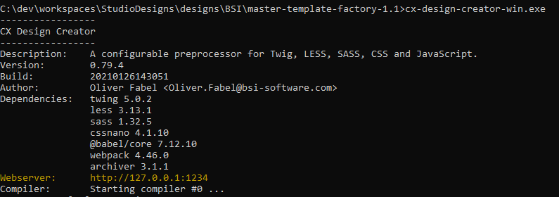
Note the reference Webserver: http://127.0.0.1:1234. The CX Design Creator publishes all content-elements that are mentioned in the file "preview-template.html" to a webserver. It is very useful to check all changes on a certain content-element locally in your browser before a .zip file is uploaded to a CX-Environment.
The CX Design Creator itself is configured with a YAML file compiler.yml:
engine: { version: '0.79.4' }
watch:
    - resources
    - properties.yml
    - template/src
task:
    ### bundle and process component specific less and javascript files
    - twig:
        - source: [template/src/_setup/components.less.twig]
          target: template/tmp/components.less
          model: [properties.yml]
          tidy: false
          validate: false
        - source: [template/src/_setup/components.js.twig]
          target: template/tmp/components.js
          model: [properties.yml]
          tidy: false
          validate: false
    - less:
        - source: [template/tmp/components.less]
          target: template/www/static/styles.css
          model:
              stack: [properties.yml]
              scope: [styles]
      js:
        - source: [template/tmp/components.js]
          target: template/www/static/scripts.js
      rm:
        - template/tmp/components.js
        - template/tmp/components.less
    ### copy resources
    - cp:
        - source: resources
          target: template/www/static
    ### create regular design files
    - twig:
          ### design.html
          - source: [template/src/base/twig/design.twig]
            target: template/www/design.html
            model: [properties.yml]
          ### content-elements.html
          - source: [template/src/base/twig/content-elements.twig]
            target: template/www/content-elements.html
            model: [properties.yml]
          ### preview-template.html
          - source: [template/src/base/twig/preview-template.twig]
            target: template/www/preview-template.html
            model: [properties.yml]
          ### design.properties
          - source: [template/src/base/twig/design.properties.twig]
            target: template/www/design.properties
            model: [properties.yml]
            tidy: false
            validate: false
      zip:
          - base: template/www
            source:
              - design.html
              - content-elements.html
              - preview-template.html
              - design.properties
              - static
            target: ../../Scaffold-1.0.1.zip
defaults:
    twig:
        validate: true
        tidy: true
        tabsize: 4
        comments: true
    less:
        compress: true
    js:
        compress: true
    global:
        charset: utf8
        compress: true
        failonerror: false
webserver:
    packages:
        - name: 'Company - Templates'
          designs:
            - name: 'Scaffold'
              viewports:
                  - type: desktop
                    width: 100%
                  - type: desktop
                    width: 940px
                  - type: tablet
                    width: 768px
                  - type: mobile
                    width: 360px
              templates:
                  - file: template/www/preview-template.html
                    language: Deutsch
A detailed description of the application and the configuration options would be beyond the scope of this guide. Just one note: When creating designs with the CX Design Creator, the generated artifacts (i.e., HTML, CSS, and Ja-vaScript files) should not be directly edited. Instead, any modifications should be made in the source code itself.
Of course, you can also use a separate tool stack to develop a design. We do not recommend the development of a design directly in HTML, CSS, and JavaScript. This may work with small templates, but it quickly becomes confusing and error prone.
5. Help
5.1. Good practices
The following things have been established as good practice in some projects. However, this approach is by no means mandatory and may vary depending on the project and individual preferences.
5.1.1. Deleting or deprecating content elements
Over time, a design evolves and due to various reasons, a certain content element may become obsolete. A good practice to phase-out a content element is to deprecate an element in a first step instead of directly deleting it. Deprecating helps to inform the end user about a content element that should no longer be added to new contents while still present in existing ones. In addition, it makes manual content migrations easier (see Refactoring content elements). In a future release, when you are sure that the content element is no longer actively in use, you can completely delete the content element.
5.1.2. Refactoring content elements
While refactoring a content element, keep in mind that your changes to a content element should never break existing content. We strongly advice to test your refactored content element to content that was created under the old design version to make sure that you do not introduce breaking changes. Critical points are renamings, changing the order for element parts and big changes to the DOM structure. In spite of that, we do encourage you to refactor where necessary, remind you to test carefully. If a refactoring is not possible due to migration issues, adding a new content element and deprecating the preexisting one (see: Deleting or deprecating content elements) is a feasible option.
5.1.3. Creating accessible designs
To ensure accessibility in CX contents, several things should be taken into account when developing a design. They help to ensure that screen readers can read out the content in the best possible way and that people with impaired vision will not be disadvantaged.
5.1.3.1. Layout
-
All functionalities (form input fields and control elements) should be accessible and operable using the keyboard (tab key). It must also be possible to exit all elements using the keyboard so that the user can navigate through all content.
-
Every website has a correct language declaration. If the main language of the page is English, all texts should be in English. If the intention is to insert text in another language, then this should be marked up accordingly with the lang attribute in the correct language.
-
Enlargement is possible in the browser, both with "Zoom" and by setting a user-defined font size
-
To ensure that screen readers interpret and parse all page content correctly, HTML elements of a website must be implemented in accordance with their W3C specifications. The W3C’s Markup Validation Services can be used to check whether the source code of a website complies with the W3C specifications.
5.1.3.2. Styling
-
The contrast ratio of the font color to the background color is at least 4.5:1
-
The contrast ratio of the font color of large font and the background color is at least 3:1
-
If color differentiation alone is used, e.g. for links in a text, the links have a contrast ratio to the surrounding continuous text of at least 3:1
-
Each element must have a visible focus state that has a contrast ratio of 3:1 to the background or non-focused state
-
No spaces to create spacing, but CSS instead
5.1.3.3. Elements
-
For information-bearing images, the alternative text must describe the visual information
-
Headings are marked with the heading element (h1, h2, … , h6)
-
The text size (font size) in web templates is defined in CSS in % or em
-
Enumerations are formatted as lists (ul, ol, dl)
-
Special text is formatted correctly, e.g. quotes as <blockquote> and <cite>
-
Video content should have synchronous subtitles
-
Data tables are formatted with the necessary markup, e.g. column, row and table headings are labeled and headings and summaries are present
5.1.3.4. Forms
-
Labels are present and meaningful. Labels and associated form input fields are logically linked (implementation with for attribute for label elements). The label should be present prior to the associated input field (exception: checkboxes, radio buttons).
-
Form fields may have an additional information text to describe what input is expected. If, for example, a certain format is expected, this should be described (e.g. "Date format: DD.MM.YYYY"). This text should be placed in front of the input field.
-
Mandatory fields should be marked (e.g. with *). The mandatory field star must not be integrated via CSS, it should be placed directly in the label. The required attribute should be added to the input element.
-
A mandatory field explanation should be provided (e.g. "Please fill in all fields marked with *"). The information must appear before the first mandatory field.
-
Error messages should appear directly below the relevant input field. They should have the attributes aria-live="assertive" (or aria-live="polite") and role="alert" so that they are read aloud by the screen reader as soon as they appear.
5.2. Troubleshooting
In this chapter, we are collecting some common issues design developers may face in their development process.
5.2.1. Design Upload
While uploading a design, BSI CX will parse the content of the ZIP file to ensure that the containing design is valid. If the parser detects inconsistencies, an error message is displayed. The following trouble shooting sections will help to correct the error.
| It is helpful to to view the details of the error message by clicking on Details, if available. |
| In Versions prior to CX 1.2.48, the error message may be cut off in the message box. Use Ctrl+C and paste the error message to any text file to view the full details. |
5.2.1.1. Validation error: File is missing
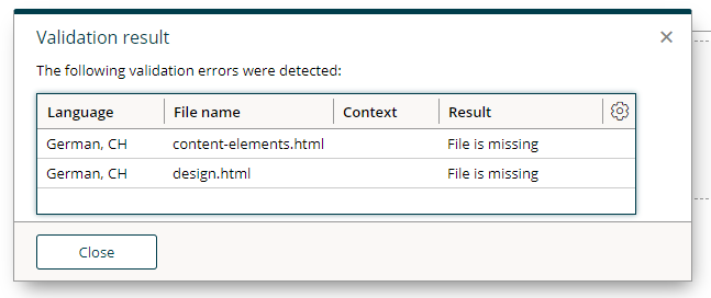
Your upload is missing a mandatory file. Please refer to File format where the mandatory files for your design type is described in detail.
5.2.1.2. Validation error: Invalid content element in 'data-bsi-dropzone-allowed-elements'
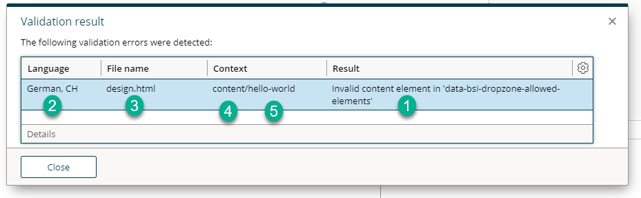
| 1 | Error message |
| 2 | Affected ZIP file |
| 3 | Affected file (within the ZIP file) |
| 4 | Name of the data-bsi-dropzone in which the error causing content element is placed |
| 5 | The name of the content element. In this case, the content element name is missing |
In one of your data-bsi-dropzone-allowed-elements='' definitions, there is an element listed which does not exist in the content-elements.html file. Common cases where this happens:
-
A content element has been deleted but it is still referred by a dropzone
-
A content element has been renamed and a dropzone is still referring to it under its previous name
-
A new content element has just been implemented, but there is a mismatch in naming. Check again the name of your data-bsi-element and make sure it matches the name in the dropzone.
<!-- Design_de-CH.zip/design.html -->
<div data-bsi-dropzone="content"
        data-bsi-dropzone-allowed-elements="basic-cta hello-world">
        <!-- hello-world should be hello-text, see below -->
</div>

<!-- Design_de-CH.zip/content-elements.html -->
<div data-bsi-group="basic">
    <!-- in design.html, the element is incorrectly referenced under the name hello-world -->
    <div data-bsi-element="hello-text" data-bsi-element-part="formatted-text">
        <p>Lorem ipsum</p>
    </div>
    <a data-bsi-element="basic-cta" href="#" data-bsi-element-part="link" class="element basic-cta">Lorem ipsum</a>
</div>
5.2.1.3. Validation error: Unknown content element part
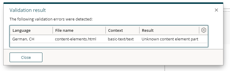
The specified data-bsi-element-part is not supported by CX. For a list of supported element parts, visit the Parts documentation chapter.
| In the example above, a text element part is specified. According to the documentation, it must either be plain-text or formatted-text. Thus, it is unknown to CX. |
5.2.1.4. Validation error: Dropzone contains sample content element that doesn’t match the structure of the reference content element
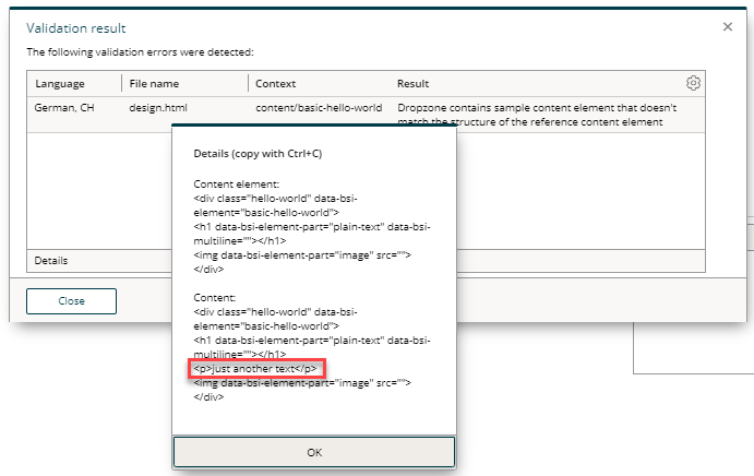
A discrepancy was discovered when using a content element as sample content. The example must have the same HTML structure as the specified content element.
| A comparison of the two elements can be displayed by clicking on Details. |
<!-- Content Element: Specification of the element (content-elements.html) -->
<div class="hello-world" data-bsi-element="basic-hello-world">
    <h1 data-bsi-element-part="plain-text">Placeholder</h1>
    <img data-bsi-element-part="image" src="placeholder.png" alt="" />
</div>
<!-- Content: sample content (design.html or content-elements.html) -->
<div class="hello-world" data-bsi-element="basic-hello-world">
    <h1 data-bsi-element-part="plain-text">Hello World, how are you?</h1> (1)
    <p>just another text</p> (3)
    <img data-bsi-element-part="image" src="hello-my-dear-world.png" alt="" /> (2)
</div>| 1 | OK: deviating text within an editable area (here: plain-text element part) |
| 2 | OK: deviating attribute, which can be edited from CX for this type anyway |
| 3 | NOT OK: adding, manipulating or removing DOM nodes is not allowed |
5.2.1.5. Validation error: Dropzone contains sample content that are not content elements
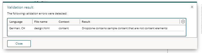
A dropzone can contain 0…n content elements. Only content elements are allowed as direct child nodes of dropzones. Therefore, HTML that is not part of a content element must not be placed in a dropzone.
<div data-bsi-dropzone="content" data-bsi-dropzone-allowed-elements="title-h1 title-h2 title-h3 basic-text basic-image basic-cta">
    <h1 data-bsi-element="title-h1" data-bsi-element-part="plain-text" class="element title-h1">Lorem ipsum</h1>
    <p>The paragraph surrounding me is not part of a content element and therefore must not be placed in the dropzone 'content'.</p>
</div>
5.2.1.6. Validation error: Part uses tag X but requires one of the following: Y,Z
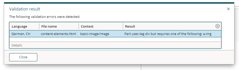
Make sure to user proper HTML tags for your element parts. Consult the content element Parts documentation for the validation error causing element.
<!-- Invalid: uses <div> which is not an image -->
<div data-bsi-element-part="image" src="img.png" alt=""></div>
<!-- Correct way: use an <img> tag -->
<img data-bsi-element-part="image" src="img.png" alt="" />
5.2.1.7. Validation error: The X tag must contain exactly one Y tag
Make sure to user proper HTML tags for your element parts. Consult the content element Parts documentation for the validation error causing element.
5.2.2. Design Update
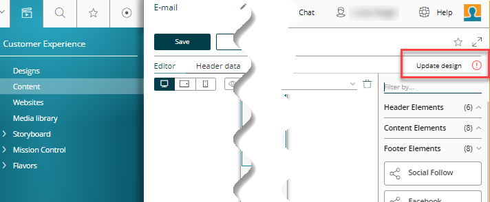
To update existing content onto the most recent version of a design, the content must be explicitly updated by clicking the Update Design button in the content editor. Success or failure of such a design update is indicated by a message box.
After an update, we advise to visually cross-check the content to make sure that a change in the design has not broken your content. In case if you are seeing content that does no longer render properly, your recent design version has introduced a flaw. in that case, you can revert the design update by clicking on the cancel button in the content editor.
Be reminded that once an updated content is saved, there is no way to go back to the older design version, unless you explicitly create a new version by selecting the respective checkbox next to the save button before saving the content.
5.2.2.1. Design Validation
After hitting the design update button or after a modification of your content, you may see a validation error indicated in the top-right corner.
In such a case, there is an issue in the design used by your content. The most typical error messages related to design issues are described in the following chapter. You may also see some that are already described in the Design Upload section.
5.2.2.2. Content does not match the structure of the referenced content element
The structure of one of your content elements that is being used right now in your content does no longer match it’s specification.
| It is helpful to to view the details of the error message by clicking on Details, if available. |
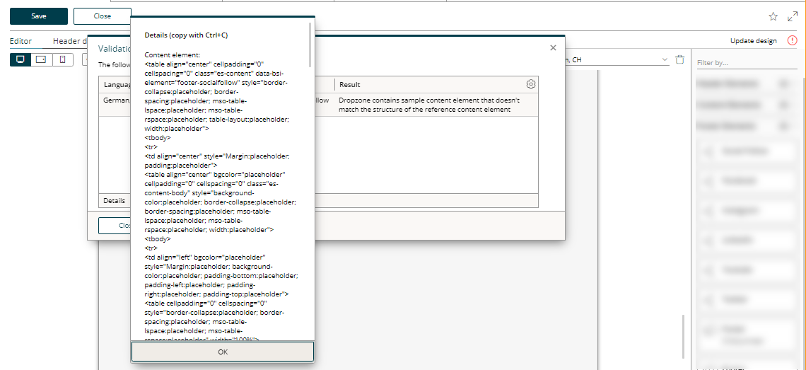
|
viewing validation error details
In versions prior to CX 1.2.48, the error message may be cut off in the message box.
|
| Use Ctrl+C and paste the error message to any text file to view the full details. |
The details of such an error message always have the same structure:
Content Element:
<div>....</div>

Content:
<div>.....</div>
If the difference is difficult to find, we recommend using a diff tool to compare the concrete content with the content element specification.
The root cause of a difference between a concrete content and the content element specification may be one of the following:
JavaScript
You have a JavaScript running that is manipulating your content element. To prevent your content from being modified through a script, make sure that you update your <script> tags in your design.html file so that the scripts will only be loaded if your content is not being edited right now in the content editor.
Removing a script tag from the DOM if the content is being edited can be achieved by adding data-bsi-remove-if='draft'.
<script data-bsi-remove-if="draft" src="your-javascript that manipulates-the-DOM.js" ></script>Duplicate attributes
If you compare the specification of the content element to the actual content and the difference is somehow related to a CSS value that is being replaced by the term placeholder, then you might have defined the error causing HTML attribute twice.

<!-- Invalid HTML: the attribute 'style' is defined twice -->
<img style="text-decoration: none;" src="img/example.png" style="width:100%; max-width: 100%;"/>

<!-- By merging the 'style' attribute, we can fix the issue above -->
<img src="img/example.png" style="text-decoration: none; width:100%; max-width: 100%;"/>
Usage of invalid HTML
Some browsers detect and try to fix invalid HTML. Therefore, the DOM structure of the HTML is modified by the browsers, whereas CX still expects the specified structure.
<!-- Invalid HTML, as defined in content-elements.html -->
<table data-bsi-dropzone="table">
    <div data-bsi-element="text">...</div>
</table>

<!-- As soon as the HTML is dropped in CX, the browser will 'fix' the HTML, leading to a different HTML for the concrete content -->
<table data-bsi-dropzone="table"></table>
<div data-bsi-element="text">...</div>
Inline SVG (older CX versions)
| This section applies to installations prior to CX 1.2.48. |
Inline SVG is not supported in older CX versions. As a workaround, you may save the SVG to a file instead and include it with an <img> tag. If it is a requirement to render the SVG inline, some projects have successfully used the Open-Source library svg-inject as a fallback.
5.2.3. Dropzone Issues
If you face issues related to dropzones (a dropzone does not allow to drop your element, the element is dropped in a different place, …), you may find a solution in this section.
5.2.3.1. Element is not dropable or being dropped in another place
| This section applies to installations prior to CX 1.2.46. |
This may happen if a dropzone name is duplicated.
Dropzones must have unique identifiers in older versions of BSI CX.
Make sure that a unique name is specified for each usage of data-bsi-dropzone.
<!-- design.html -->
<div class="main-dropzone" data-bsi-dropzone="content" (1)
     data-bsi-dropzone-allowed-elements=".....">
    <!-- ... -->
</div>

<!-- content-elements.html -->
<div class="image-area" data-bsi-dropzone="content" (2)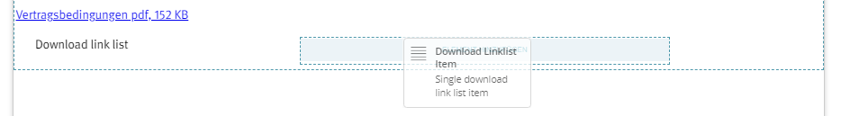
data-bsi-dropzone-allowed-elements="download-item"></div>| 1 | A dropzone named 'content' is being defined properly |
| 2 | Violation: another dropzone with the same name is defined again. Solution: change data-bsi-dropzone to another value, e.g. data-bsi-dropzone="image-area-content" |
5.2.4. Design Creator Issues
5.2.4.1. Why is the Design Creator End of Life?
We’ve built a next generation Design Build that is Open-Source and based on widely used tech stack. You may find more information on GitHub.
5.2.4.2. Is there any detailed documentation for the CX Design Creator
Unfortunately there is no detailed documentation. We do no longer invest into the CX Design Creator as our sucessor, the CX Design Build, is ready to use.
5.2.4.3. HTML Comments / MSO Tags missing after running the CX Design Creator
If you are using the CX Design Creator and your HTML in the design.zip is missing all HTML comments and therefore all outlook specific code is missing, change the tidy property to false in the compiler.yml:
defaults:
    twig:
        comments: true
        tidy: false
5.2.5. Content Editor Limitations
5.2.5.1. Using CSS viewport units
If you want to use CSS viewport units, e.g. viewport-height vh, please note the following:
The content displayed in the content editor is embedded in an iframe. When elements defined by a CSS viewport unit are placed inside an iframe, the size of the iframe is used as a reference, not the size of the screen as desired.
Therefore, the CSS classes bsi-ce-edit-mode and bsi-ce-preview-mode (see Content editor specific CSS) should be used to define a fixed height/width as alternative to the viewport height/width for proper display in the content editor and preview mode. It is also important to note that this fixed height/width should be set as minimum size of the element with the CSS viewport unit. Otherwise CX will calculate the size of the content editor incorrectly.
See the following example:
.header-image {
    height: calc(100vh - 32px);
    min-height: 800px !important;
}
.bsi-ce-edit-mode .header-image,
.bsi-ce-preview-mode .header-image {
    height: 800px !important;
}