Help
Good practices
The following things have been established as good practice in some projects. However, this approach is by no means mandatory and may vary depending on the project and individual preferences.
Deleting or deprecating content elements
It is possible to archive content elements in a design without losing these elements in an existing content after updating the design (see [archiving-elements]). Instead of deleting content elements, we strongly recommend archiving content elements.
Refactoring content elements
While refactoring a content element, keep in mind that your changes to a content element should never break existing content. We strongly advice to test your refactored content element to content that was created under the old design version to make sure that you do not introduce breaking changes. Critical points are renamings, changing the order for element parts and big changes to the DOM structure. In spite of that, we do encourage you to refactor where necessary, remind you to test carefully. If a refactoring is not possible due to migration issues, adding a new content element and deprecating the preexisting one (see: Deleting or deprecating content elements) is a feasible option.
Creating accessible designs
To ensure accessibility in BSI CX contents, several things should be taken into account when developing a design. They help to ensure that screen readers can read out the content in the best possible way and that people with impaired vision will not be disadvantaged.
Layout
-
All functionalities (form input fields and control elements) should be accessible and operable using the keyboard (tab key). It must also be possible to exit all elements using the keyboard so that the user can navigate through all content.
-
Every website has a correct language declaration. If the main language of the page is English, all texts should be in English. If the intention is to insert text in another language, then this should be marked up accordingly with the lang attribute in the correct language.
-
Enlargement is possible in the browser, both with "Zoom" and by setting a user-defined font size
-
To ensure that screen readers interpret and parse all page content correctly, HTML elements of a website must be implemented in accordance with their W3C specifications. The W3C’s Markup Validation Services can be used to check whether the source code of a website complies with the W3C specifications.
Styling
-
The contrast ratio of the font color to the background color is at least 4.5:1
-
The contrast ratio of the font color of large font and the background color is at least 3:1
-
If color differentiation alone is used, e.g. for links in a text, the links have a contrast ratio to the surrounding continuous text of at least 3:1
-
Each element must have a visible focus state that has a contrast ratio of 3:1 to the background or non-focused state
-
No spaces to create spacing, but CSS instead
Elements
-
For information-bearing images, the alternative text must describe the visual information
-
Headings are marked with the heading element (h1, h2, … , h6)
-
The text size (font size) in web templates is defined in CSS in % or em
-
Enumerations are formatted as lists (ul, ol, dl)
-
Special text is formatted correctly, e.g. quotes as <blockquote> and <cite>
-
Video content should have synchronous subtitles
-
Data tables are formatted with the necessary markup, e.g. column, row and table headings are labeled and headings and summaries are present
Forms
-
Labels are present and meaningful. Labels and associated form input fields are logically linked (implementation with for attribute for label elements). The label should be present prior to the associated input field (exception: checkboxes, radio buttons).
-
Form fields may have an additional information text to describe what input is expected. If, for example, a certain format is expected, this should be described (e.g. "Date format: DD.MM.YYYY"). This text should be placed in front of the input field.
-
Mandatory fields should be marked (e.g. with *). The mandatory field star must not be integrated via CSS, it should be placed directly in the label. The required attribute should be added to the input element.
-
A mandatory field explanation should be provided (e.g. "Please fill in all fields marked with *"). The information must appear before the first mandatory field.
-
Error messages should appear directly below the relevant input field. They should have the attributes aria-live="assertive" (or aria-live="polite") and role="alert" so that they are read aloud by the screen reader as soon as they appear.
Troubleshooting
In this chapter, we are collecting some common issues design developers may face in their development process.
Design Upload
While uploading a design, BSI CX will parse the content of the ZIP file to ensure that the containing design is valid. If the parser detects inconsistencies, an error message is displayed. The following trouble shooting sections will help to correct the error.
| It is helpful to to view the details of the error message by clicking on Details, if available. |
Validation error: File is missing
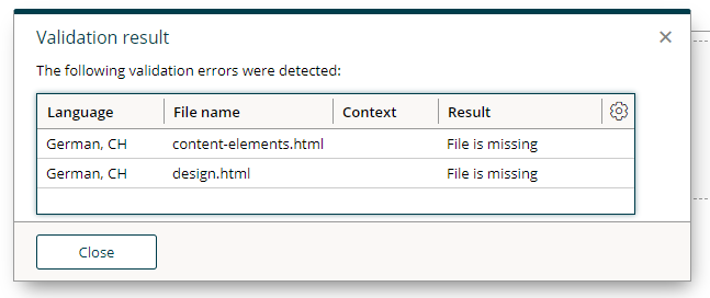
Your upload is missing a mandatory file. Please refer to [File format] where the mandatory files for your design type is described in detail.
Validation error: Invalid content element in 'data-bsi-dropzone-allowed-elements'
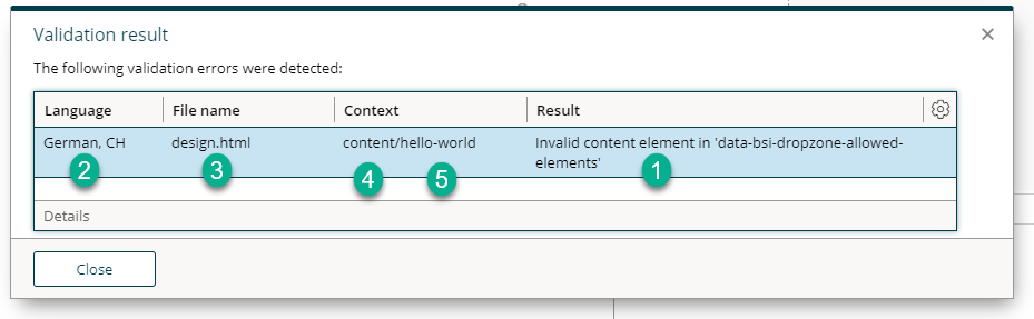
-
Error message
-
Affected ZIP file
-
Affected file (within the ZIP file)
-
Name of the data-bsi-dropzone in which the error causing content element is placed
-
The name of the content element. In this case, the content element name is missing
In one of your data-bsi-dropzone-allowed-elements='' definitions, there is an element listed which does not exist in the content-elements.html file. Common cases where this happens:
-
A content element has been deleted but it is still referred by a dropzone
-
A content element has been renamed and a dropzone is still referring to it under its previous name
-
A new content element has just been implemented, but there is a mismatch in naming. Check again the name of your data-bsi-element and make sure it matches the name in the dropzone.
<!-- Design_de-CH.zip/design.html -->
<div data-bsi-dropzone="content"
        data-bsi-dropzone-allowed-elements="basic-cta hello-world">
        <!-- hello-world should be hello-text, see below -->
</div>

<!-- Design_de-CH.zip/content-elements.html -->
<div data-bsi-group="basic">
    <!-- in design.html, the element is incorrectly referenced under the name hello-world -->
    <div data-bsi-element="hello-text" data-bsi-element-part="formatted-text">
        <p>Lorem ipsum</p>
    </div>
    <a data-bsi-element="basic-cta" href="#" data-bsi-element-part="link" class="element basic-cta">Lorem ipsum</a>
</div>
Validation error: Unknown content element part
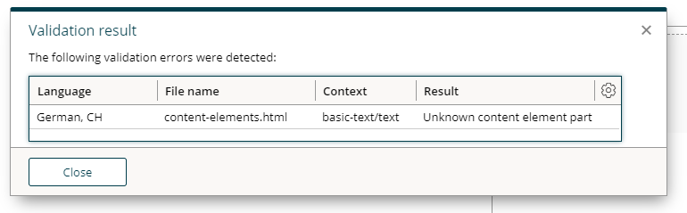
The specified data-bsi-element-part is not supported by BSI CX. For a list of supported element parts, visit the [Parts] documentation chapter.
| In the example above, a text element part is specified. According to the documentation, it must either be plain-text or formatted-text. Thus, it is unknown to BSI CX. |
Validation error: Dropzone contains sample content element that doesn’t match the structure of the reference content element
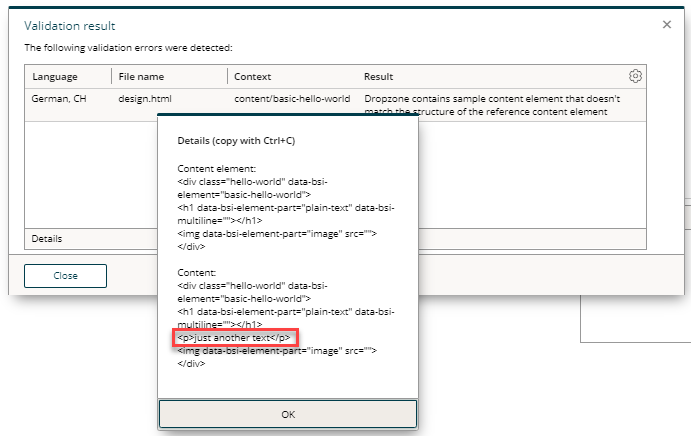
A discrepancy was discovered when using a content element as sample content. The example must have the same HTML structure as the specified content element.
| A comparison of the two elements can be displayed by clicking on Details. |
<!-- Content Element: Specification of the element (content-elements.html) -->
<div class="hello-world" data-bsi-element="basic-hello-world">
    <h1 data-bsi-element-part="plain-text">Placeholder</h1>
    <img data-bsi-element-part="image" src="placeholder.png" alt="" />
</div>
<!-- Content: sample content (design.html or content-elements.html) -->
<div class="hello-world" data-bsi-element="basic-hello-world">
    <h1 data-bsi-element-part="plain-text">Hello World, how are you?</h1> (1)
    <p>just another text</p> (3)
    <img data-bsi-element-part="image" src="hello-my-dear-world.png" alt="" /> (2)
</div>| 1 | OK: deviating text within an editable area (here: plain-text element part) |
| 2 | OK: deviating attribute, which can be edited from BSI CX for this type anyway |
| 3 | NOT OK: adding, manipulating or removing DOM nodes is not allowed |
Validation error: Dropzone contains sample content that are not content elements
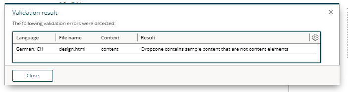
A dropzone can contain 0…n content elements. Only content elements are allowed as direct child nodes of dropzones. Therefore, HTML that is not part of a content element must not be placed in a dropzone.
<div data-bsi-dropzone="content" data-bsi-dropzone-allowed-elements="title-h1 title-h2 title-h3 basic-text basic-image basic-cta">
    <h1 data-bsi-element="title-h1" data-bsi-element-part="plain-text" class="element title-h1">Lorem ipsum</h1>
    <p>The paragraph surrounding me is not part of a content element and therefore must not be placed in the dropzone 'content'.</p>
</div>
Validation error: Part uses tag X but requires one of the following: Y,Z
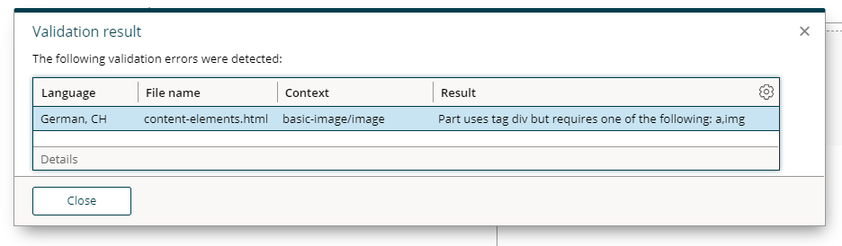
Make sure to user proper HTML tags for your element parts. Consult the content element [Parts] documentation for the validation error causing element.
<!-- Invalid: uses <div> which is not an image -->
<div data-bsi-element-part="image" src="img.png" alt=""></div>
<!-- Correct way: use an <img> tag -->
<img data-bsi-element-part="image" src="img.png" alt="" />
Validation error: The X tag must contain exactly one Y tag
Make sure to user proper HTML tags for your element parts. Consult the content element [Parts] documentation for the validation error causing element.
Design Update
To update existing content onto the most recent version of a design, the content must be explicitly updated by clicking the Update Design button in the content editor. Success or failure of such a design update is indicated by a message box.
After an update, we advise to visually cross-check the content to make sure that a change in the design has not broken your content. In case if you are seeing content that does no longer render properly, your recent design version has introduced a flaw. in that case, you can revert the design update by clicking on the cancel button in the content editor.
Be reminded that once an updated content is saved, there is no way to go back to the older design version, unless you explicitly create a new version by selecting the respective checkbox next to the save button before saving the content.
Design Validation
After hitting the design update button or after a modification of your content, you may see a validation error indicated in the top-right corner.
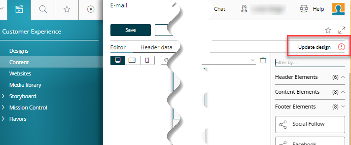
In such a case, there is an issue in the design used by your content. The most typical error messages related to design issues are described in the following chapter. You may also see some that are already described in the Design Upload section.
Content does not match the structure of the referenced content element
The structure of one of your content elements that is being used right now in your content does no longer match it’s specification.
| It is helpful to to view the details of the error message by clicking on Details, if available. |
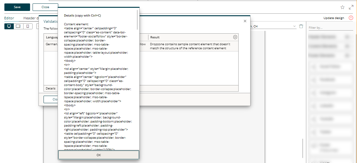
|
viewing validation error details
In versions prior to BSI CX 1.2.48, the error message may be cut off in the message box.
|
| Use kbd:[Ctrl+C] and paste the error message to any text file to view the full details. |
The details of such an error message always have the same structure:
Content Element:
<div>....</div>

Content:
<div>.....</div>
If the difference is difficult to find, we recommend using a diff tool to compare the concrete content with the content element specification.
The root cause of a difference between a concrete content and the content element specification may be one of the following:
JavaScript
You have a JavaScript running that is manipulating your content element. To prevent your content from being modified through a script, make sure that you update your <script> tags in your design.html file so that the scripts will only be loaded if your content is not being edited right now in the content editor.
Removing a script tag from the DOM if the content is being edited can be achieved by adding data-bsi-remove-if='draft'.
<script data-bsi-remove-if="draft" src="your-javascript that manipulates-the-DOM.js" ></script>Duplicate attributes
If you compare the specification of the content element to the actual content and the difference is somehow related to a CSS value that is being replaced by the term placeholder, then you might have defined the error causing HTML attribute twice.

<!-- Invalid HTML: the attribute 'style' is defined twice -->
<img style="text-decoration: none;" src="img/example.png" style="width:100%; max-width: 100%;"/>

<!-- By merging the 'style' attribute, we can fix the issue above -->
<img src="img/example.png" style="text-decoration: none; width:100%; max-width: 100%;"/>
Usage of invalid HTML
Some browsers detect and try to fix invalid HTML. Therefore, the DOM structure of the HTML is modified by the browsers, whereas BSI CX still expects the specified structure.
<!-- Invalid HTML, as defined in content-elements.html -->
<table data-bsi-dropzone="table">
    <div data-bsi-element="text">...</div>
</table>

<!-- As soon as the HTML is dropped in BSI CX, the browser will 'fix' the HTML, leading to a different HTML for the concrete content -->
<table data-bsi-dropzone="table"></table>
<div data-bsi-element="text">...</div>
Inline SVG (older BSI CX versions)
| This section applies to installations prior to BSI CX 1.2.48. |
Inline SVG is not supported in older BSI CX versions. As a workaround, you may save the SVG to a file instead and include it with an <img> tag. If it is a requirement to render the SVG inline, some projects have successfully used the Open-Source library svg-inject as a fallback.
Dropzone Issues
If you face issues related to dropzones (a dropzone does not allow to drop your element, the element is dropped in a different place, …), you may find a solution in this section.
Element is not dropable or being dropped in another place
| This section applies to installations prior to BSI CX 1.2.46. |

This may happen if a dropzone name is duplicated.
Dropzones must have unique identifiers in older versions of BSI CX.
Make sure that a unique name is specified for each usage of data-bsi-dropzone.
<!-- design.html -->
<div class="main-dropzone" data-bsi-dropzone="content" (1)
     data-bsi-dropzone-allowed-elements=".....">
    <!-- ... -->
</div>

<!-- content-elements.html -->
<div class="image-area" data-bsi-dropzone="content" (2)
data-bsi-dropzone-allowed-elements="download-item"></div>| 1 | A dropzone named 'content' is being defined properly |
| 2 | Violation: another dropzone with the same name is defined again. Solution: change data-bsi-dropzone to another value, e.g. data-bsi-dropzone="image-area-content" |
Content Editor Limitations
Using CSS viewport units
If you want to use CSS viewport units, e.g. viewport-height vh, please note the following:
The content displayed in the content editor is embedded in an iframe. When elements defined by a CSS viewport unit are placed inside an iframe, the size of the iframe is used as a reference, not the size of the screen as desired.
Therefore, the CSS classes bsi-ce-edit-mode and bsi-ce-preview-mode (see [content-editor-specific-css]) should be used to define a fixed height/width as alternative to the viewport height/width for proper display in the content editor and preview mode. It is also important to note that this fixed height/width should be set as minimum size of the element with the CSS viewport unit. Otherwise BSI CX will calculate the size of the content editor incorrectly.
See the following example:
.header-image {
    height: calc(100vh - 32px);
    min-height: 800px !important;
}
.bsi-ce-edit-mode .header-image,
.bsi-ce-preview-mode .header-image {
    height: 800px !important;
}