Content Editor
Content editor specific CSS
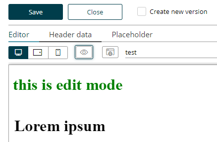
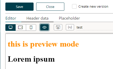
Sometimes it is useful to apply special CSS rules to the content when the page is in edit or preview mode. There are two special CSS classes set on the document’s <html> tag to address such use cases:
-
bsi-ce-edit-mode is set when the document is shown in the content editor.
-
bsi-ce-preview-mode is set when the document is shown in preview mode inside the content editor.
The preview mode outside the content editor or any content that is delivered by a story will not have any of the above listed classes.
<html><head><!-- head omitted --></head>
<body>
    <h1 class="hide show-if-edit">this is edit mode</h1>
    <h1 class="hide show-if-preview">this is preview mode</h1>
    <!-- rest of body omitted -->
</body>.hide { display: none; }
.bsi-ce-edit-mode .show-if-edit { display: block; color:green; }
.bsi-ce-preview-mode .show-if-preview { display: block; color:darkorange; }| Edit mode |
|---|
Preview Mode |
|
|
Predefined Story outlets (Bracket Links)
One way to define a link out of a design is to use a data-bsi-element-part="link" annotation on a link (<a>) element.
Doing so will add a link editor to enter a URL and a link text to the content editor.
<a data-bsi-element-part="link" href="https://www.bsi-software.com/">BSI Website</a>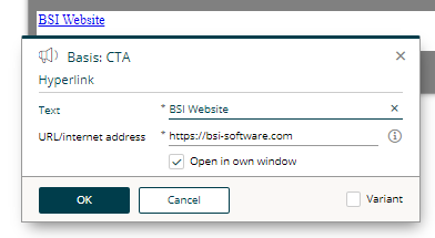
Another way to define a link directly out of a design is by using the BSI CX bracket link syntax for links. This mechanism in built into the content editor itself to create a link anywhere in a text.
<span data-bsi-element-part="plain-text" >If you do not wish to receive further promotions, you can [unsubscribe] now.</span>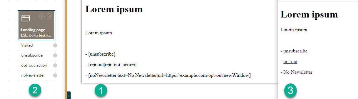
-
Definition of links using the BSI CX bracket syntax.
-
Each link is converted into a story outlet. Each outlet can then be linked to an individual action in the story.
-
The content that is delivered to the user.
While rendering the above content, BSI CX will convert the [unsubscribe] term to a link tag internally, create a unique hyperlink and will add a new outlet to the step to which the current content belongs.
When using bracket links, the story designer will see the provided link as a story outlet by default.
This allows the Story Designer to link the click action on the link with other steps (e.g. a subsequent landing page step).
In the example above, the Email Step will already have an outlet named unsubscribe.
The bracket technique itself is usable everywhere in the content editor and is not limited to the usage in a design.
The convenience format of a bracket link for BSI CX is [link text|ID].
The full syntax is [ID|text=link text|url=https://example.com|newWindow].
You may use the following optional parameters:
-
urlcan be used to explicitly specify an absolute URL. -
newWindowwill force to open the target in a new tab or window. -
followremoves the nofollow value from the html rel attribute. Without nofollow, bots are allowed to crawl your page (not recommended for personalised links). -
logincreates a link having the query parameter ?login, which redirects to the login page in a website. -
logoutcreates a link having the query parameter ?logout, which removes the authenticated user from a BSI CX HTTP session in a website.
If a bracket itself should be part of a link, it can be escaped with a backslash (e.g. [\[click me\]|id] will then be visualized as [click me]).
You can also place a bracket link anywhere in the design.
An example of doing so is to add it to an href of a link.
<a href="[Facebook]"><img src="img/facebook.png" /></a>| Be reminded that all BSI CX will replace everything that looks like a bracket link. It is your responsibility as a developer to use escaping where brackets have a different meaning. |
<!-- BSI CX will convert this to a bracket link -->
<input pattern="[0-9]">

<!-- escaping is mandatory for the pattern mechanism to work as desired -->
<input pattern="\[0-9]">
Bracket links in iterators
When you display data in a table, you will use the iterator feature of BSI CX. In this example we display a list of blog articles.
In the content editor you use a table content-element. You activate the 'Dynamic table' checkbox in the editor form. Now you define the columns. Let’s assume we have 3 columns:
-
{blog.title}
-
{blog.releaseDate}
-
[blog.details] [blog.edit]
The third column defines two iterator bracket links. The link ID must start with the entity prefix, which is followed by an arbitrary name that defines the function of the link.
When you use this content in a media step in the storyboard, the step will provide a GUI, to pick an entity and the values for the placeholders 'title' and 'releaseDate'. For the two links the step will generate two outlets. A consequent step connected to these outlets can pick from the iterator property which is labeled with 'Chosen via link' and can access the properties of that distinct iterator item.
Styling of bracket links
When BSI CX converts a [placeholder] term internally into a link tag, it adds the CSS class placeholder-link to the a tag. This allows bracket links to be selected and styled separately from other link elements.
placeholder-linka.placeholder-link {color: #fe9915;}
.footer-div a.placeholder-link {color: #ffffff;}It should be noted that the CSS class is not set until the live content is rendered. For this reason, you won’t find the styling, referring to the CSS class placeholder-link, in the content editor, but only - in the case of email content - in the sent email.
Using anchor links inside a design
First of all, it is possible to use anchor links in the form of #top inside a BSI CX design.
Anchor links are allowed as targets of link parts.
However, it is not possible to use anchor links as url of a bracket link.
This is due to the fact, that bracket links meant to be trackable by BSI CX and this requires a complete roundtrip to the server.
<section id="news">
    <!-- some news -->
</section>

<!-- some more html code -->

<div data-bsi-element="cta">
    <a href="#news" data-bsi-element-part="link">Jump to news</a>
</div>
Websites
Terms
-
Website: The complete website. Contains several pages in different languages.
-
Page: A single page within a website. Pages appear in the navigation and have a content in different languages.
-
Include: A content snippet, which is saved locally once and can be referenced at any point within the website. We differentiate between built-in includes and custom includes. Built-in includes are content snippets that are included in the design.zip, custom includes are created by the user based on a content-element.
-
Website content type: Website content type items are pages from a website with a specific type, like a blog or a press release. Other than website pages, website content type items do not affect the structure of the website. Which means, a user can publish for instance a blog page, without changes to the story that uses the website. Additionally, a website content type has specific fields, like author or tags. With the "Website Content Type Query" step you can query, filter and sort website content type items dynamically and use the results as BSI CX iterator or as REST response in the frontend code of the website.
Concepts
-
BSI CX-Placeholders can be used on every page of a website. Their scope generally involves a single page. For example the placeholder
"{Subject}"has to be mapped once for each page that uses it. A placeholder within an include (e.g. header or footer) only has to be mapped once. An example for that case would be the display of"{Username}"within the header of a portal-website. Placeholders can not be used within page-titles or the navigation. -
Custom includes can’t be nested. Technically, that would be possible, but it would need many checks and visualizations inside the content editor to detect potential infinite recursions and give feedback to the user through reasonable error messages. For that reason we currently don’t support that feature.
-
An include can only be used once within the same page.
-
Multilingualism: All contents and their includes are always created in every active language for their website. E.g.: The website is configured to be German and Italian. On the creation of a new page, two pages will be created: one for Italian and one for German (including their dummy-contents). Within the UI there is no option to create a single page in one specific language only. If necessary, a BSI CX-condition may be used to hide a page for a specific language inside the navigation-tree.
Handlebars, Templates
The template engine Handlebars is available to the design developer at runtime. The templates are parsed server-sided. We’re using the Java-Port by JKnack. In the design, handlebars templates are important especially for display of the navigation.
Handlebars templates can only be used for parts of a website that can’t be edited by the user. We set that rule, because templates are parsed server-sided. When the content-editor receives the HTML source, the templates have already been resolved. If the user would edit a content-element that contained handlebars syntax, we could only save the rendered content that the user edited. The original handlebars code would be lost.
For that reason, handlebars should mostly be used for includes that can’t be edited. Examples for such includes are the master (design.html), the navigation or areas outside a dropzone.
This mechanism can also be used consciously to set multilingual default texts, which are deposited inside the website.json file. An example for an include for the website header in handlebars code could look something like this:
<div data-bsi-element="master-header">
  <img src="img/nyan-cat.gif">
  <h1 data-bsi-element-part="plain-text">{{bsi.nls "website.title"}}</h1>
</div>
On the initial rendering of the page inside the content editor, the text "website.title" is resolved. As the user saves the page, the initial handlebars code is substituted by the actual text.
Handlebars syntax can also be used in the content-element source files; especially for the NLS-helper to define multilingual default texts for each content-element. Content-elements with Handlebars must have the file extension .hbs.
Important: Files that contain Handlebars syntax aren’t valid HTML documents. They shouldn’t be handled with HTML parsers like JSoup, otherwise the handlebars syntax gets corrupted. Files that include handlebars code should use the suffix .hbs. IntelliJ supports this syntax with respective plugins.
Handlebars Helpers
Besides the built-in standard helper, BSI CX may also use the following helpers:
bsi.nls
This helper is used to resolve localized texts or resources inside the design. The syntax looks like this: {{bsi.nls '[textKey]'}}.
It can also be used inside the content element Handlebars files to deliver localized default texts for different languages.
Text keys are created inside the design.json at the property nls. Text that doesn’t depend on the locale is defined with the key *. The resolution follows from the most specific locale up to the default, e.g.:
{
  "nls": {
    "hello.world": {
      "*": "Hello World",
      "de": "Hallo Welt",
      "de-CH": "Sali Wält"
    }
  }
}
bsi.jsonStringify
This helper is used to output a JSON object (or more precise, a DO entity from the BSI customer suite) into a string representation. Example:
<meta name="x-metadata" content="{{bsi.jsonStringify page.metadata}}">Depending on the actual value of the 'metadata' object, this could output:
<meta name="x-metadata" content="{"value"=123}">bsi.localeLanguage
This helper is used to output the 'language' part of a Java Locale string. Example, assuming locale is 'de-CH':
<meta name="x-language" content="{{bsi.localeLanguage locale}}">Output:
<meta name="x-language" content="de">bsi.localeCountry
This helper is used to output the 'country' part of a Java Locale string. Depending on the actual value of the locale, this helper may return an empty string. Example, assuming locale is 'de-CH':
<meta name="x-country" content="{{bsi.localeCountry locale}}">Output:
<meta name="x-country" content="CH">bsi.nl2br
This helper is used to replace newline characters with an HTML BR tag in a plain text string. Example, assuming the value of text is 'Hello\n<b>World</b>':
<div>{{bsi.nl2br text}}</div>Output:
<div>Hello<br><b>World</b></div>Handlebars Variables
Following variables are available to the design developer on runtime. The variables can be used in handlebars templates, e.g.: {{navigation.activePage.contentId}}.
Top-Level
-
defaultLocale (String): Default locale of the website. Can be used to compare locales, for instance in an
hreflangattribute to render the valuex-defaultwhen a locale is equals the defaultLocale. Example:en. -
designBaseUrl (String): base URL of the design on the resource server.
-
language (String): Current language as it’s used in the
langattribute of the HTML tag, e.g.:de. -
locale (String): Complete locale. The locale is used to resolve text keys through the
bsi.nlshelper, e.g.de-CH. -
localizedWebsiteBaseUrl (String) The (root) base URL of the website, including the Locale part. Example: http://localhost:8085/inbound/default/e/l/my-website/de-CH
-
navigation (Navigation object): Contains the hierarchical navigation tree, example follows.
-
page (Navigation Item object): The currently active page. This is a shortcut for
navigation.activePage. Note: if the current page is a website content type item which is linked to a navigation item through theactiveWhenWebsiteContentTypeproperty, the 'page' property points to the website content type item, but the 'navigation.activePage' points to the navigation item. There might be a difference regarding the titles. -
paginationInfo (Pagination Info object): Contains the information for pagination. This object is only filled if the pagination feature is specified in the
design.jsonfile. -
resourceBaseUrl (String): base URL of the resource server.
-
title (String): Title of the website. Matches the field "Title" in the website-masters editor. Can be used in combination with the title of the current page to display the title of the HTML document, e.g.:
{{title}} | {{navigation.activePage.pageTitle}}. -
websiteBaseUrl (String) The (root) base URL of the website, without the Locale part. Example: http://localhost:8085/inbound/default/e/l/my-website
Navigation (Object)
-
activePage (Navigation Item object) The currently active page
-
items (array of Navigation Item objects) A hierarchical list of navigation items. Loop through these nested arrays, to render the navigation of the website.
Navigation Item (Object)
-
id (UUID): Primary key according to table BSI_WEBSITE_REV_NAV#ID.
-
contentId (UUID): Primary key according to table BSI_WEBSITE_REV_CONT#ID.
-
url (String): The URL for a website page or website content type item.
-
createDate (String): The create date of the website page or website content type item.
-
updateDate (String): The update date of the website page or website content type item.
-
canonicalUrl (String): The optional canonical URL for the website page or website content type item.
-
active (Boolean):
Trueif the navigation element (page) is active, which means it should appear highlighted in the navigation. -
folder (Boolean):
Trueif BSI_WEBSITE_REV_NAV_LOCALE#NAV_ITEM_TYPE = "folder". Used to distinct pages and folders in the navigation. -
level (Integer): Recursion-level of the navigation element, starting with 0 = Root.
-
image (String): Locale independent absolute image URL. Can be used to render an icon for the website page in the navigation.
-
localizedImage (String): Locale dependent absolute image URL. Can be used to render a localized preview image for the website content type item.
-
title (String): The title of the navigation item.
-
pageTitle (String): The page title of the website page or website content type item.
-
pageTitleShort (String): The short page title of the website page or website content type item. Can be used to render an 'og:title' meta tag in the HTML.
-
description (String): The description of the website page or website content type item. Can be used to render a 'description' meta tag in the HTML.
-
descriptionShort (String): The short description of the website page or website content type item. Can be used to render an 'og:description' meta tag in the HTML.
-
openGraphType (String): The Open Graph type of the website page or website content type item. Can be used to render an 'og:type' meta tag in the HTML.
-
tags (Array of strings): An array of strings with tags for the website page or website content type item, as used in a tag cloud in a blog.
-
noindex (Boolean): Whether the website page or website content type item should be indexed by a search engine crawler. Can be used to render a 'robots/noindex' meta tag in the HTML.
-
nofollow (Boolean): Whether the link to a website page should be followed by a search engine crawler. Can be used to render a 'rel/nofollow' attribute in the HTML.
-
localizedUrls (Object): Object with URL as value and locale as key. Can be used to render a language-switch widget in the HTML.
-
metadata: (Object) Locale independent JSON metadata of the website page or website content type item.
-
localizedMetadata: (Object) Locale dependent JSON metadata of the website page or website content type item.
-
items (array of Navigation Item objects) A hierarchical list of child navigation items.
-
authorName (String): The author name of the website content type item. Only available for the active page.
-
authorImage (String): Absolute image URL. The author image of the website content type item. Can be used to render an image of the author. Only available for the active page.
-
localizedAuthorDescription (String): The localized author description of the website content type item. Only available for the active page.
Pagination (Object)
-
currentPageNo (Number): Current page number.
-
numDataRecordsPerPage (Number): Number of records per page.
-
firstDataRecordOffset (Number): Index of the first record on the current page.
-
totalNumDataRecords (Number): Total number of existing records.
-
firstPageUrl (String): URL of the first page.
-
lastPageUrl (String): URL of the last page.
-
lastPageNo (Number): Page number of the last page.
-
previousPages (Array of Pagination Page objects): Provides information on pages previous to the current page.
-
nextpages (Array of Pagination Page objects): Provides information on the next pages following the current page.
Pagination Page (Object)
-
pageNo (Number): Page number.
-
url (String): URL of the page.
-
index (Number): Offset of the page number to the current page number.
Handlebars Variables Example (as JSON)
The following JSON snippet shows the possible content of a variables object at runtime.
{
  "title": "BSI Software",
  "language": "de",
  "locale": "de-CH",
  "page": {
    "id": "1006",
    "contentId": "2006",
    "url": "ueber-bsi.html",
    "title": "Über BSI",
    "pageTitle": "Erfahren Sie mehr zu BSI",
    "level": 0,
    "active": true,
    "localizedUrls": {
      "de-CH": "ueber-bsi.html",
      "en-CH": "about-bsi.html"
    }
  },
  "navigation": {
    "activePage": {
      "id": "1006",
      "...": "INFO: same object as in 'page'"
    },
    "items": [
      {
        "id": "1002",
        "contentId": "2002",
        "url": "loesungen.html",
        "title": "Lösungen",
        "pageTitle": "Lösungen für Ihre Kunden",
        "level": 0
      },
      {
        "id": "1003",
        "contentId": "2003",
        "url": "branchen.html",
        "title": "Branchen",
        "folder": true,
        "level": 0,
        "items": [
          {
            "id": "1004",
            "contentId": "2004",
            "url": "banking.html",
            "title": "Banking",
            "pageTitle": "Lösungen fürs Finanzwesen",
            "level": 1
          },
          {
            "id": "1005",
            "contentId": "2005",
            "url": "health.html",
            "title": "Health",
            "pageTitle": "Lösungen fürs Gesundheitswesen",
            "level": 1
          }
        ]
      },
      {
        "id": "1006",
        "...": "INFO: same object as in 'page'"
      }
    ]
  }
}
The following Handlebars (.hbs) code snippet shows how the variables provided in the example above, are used in the template. The example shows a typical template for the website navigation.
{{#navigation}}
<nav class="navigation">
  {{#items}}
    <ul class="nav-item-container level-root">
      <li class="nav-item level-root">
      <!-- root level -->
      {{#active}}
        <span class="nav-item-active">{{title}}</span>
      {{/active}}
      {{^active}}
        <a href="{{url}}">{{title}}</a>
      {{/active}}
      </li>
      {{#items}}
      <ul class="nav-item-container level-1st">
        <!-- 1st level -->
        <li class="nav-item level-1st">
        {{#active}}
          <span class="nav-item-active">{{title}}</span>
        {{/active}}
        {{^active}}
          <a href="{{url}}">{{title}}</a>
        {{/active}}
        </li>
      </ul>
      {{/items}}
    </ul>
  {{/items}}
</nav>
{{/navigation}}
Working with Pre-Defined Includes
Pre-defined includes act like a regular content-element in the website editor, but they cannot be edited by the user. Instead pre-defined includes are defined as a Handlebars template, which means it is possible to use all the variables provided by the website. The Handlebars placeholders are not resolved when the page is edited in the website editor, but only when the page is finally rendered in the browser.
This allows to build content-elements which output data available as metadata on the page, for instance the 'page title' or the 'description'. The advantage for the content user is, that he or she must not copy/paste content already defined as metadata.
The following example shows how to make a pre-defined include 'page-info.hbs', which outputs the 'page title' and the description.
<div class="page-info" data-bsi-element="page-info" data-bsi-hide-edit-button="true">
  <p>Page title: <b>{{page.pageTitle}}</b></p>
  <p>Description: {{page.description}}</p>
</div>
In the design.json you must define the pre-defined include and also define a content-element. You can reference the same file in both places. Note, the example shows only the relevant part of the design.json.
{
  "contentElementGroups": [{
    "groupId": "content",
    "contentElements": [
        {
          "elementId": "page-info",
          "file": "include/page-info.hbs",
          "label": "Page Info",
          "icon": "info",
          "hidden": true
        }
      ]
  }],
  "website": {
    "includes":{
      "page-info": {
        "includeType": "pre-defined",
        "file": "include/page-info.hbs",
        "name": "Page Info",
        "editable": false
      }
    }
  }
}
Do not forget to add the new content-element/include to the data-bsi-dropzone-allowed-elements attribute in your dropzones.
|
Configuration files
This chapter describes the necessary configuration files.
Website-specific metadata inside design.json
The design.json file is a metadata file for structured configuration data.
Example for the design.json file for website designs:
{
  "schemaVersion": "25.1",
  "defaultLocale": "de",
  "locales": ["de", "en"],
  "nls": {
    "page": {
      "*": "Seite",
      "en": "Page"
    }
  },
  "website": {
    "maxNavigationLevel": 2,
    "pagination": {
      "numDataRecordsPerPage": 20,
      "numAdjacentPages": 3
    },
    "includes":{
      "page": {
        "name": "Vorlage für Inhaltsseiten",
        "reference": "page",
        "file": "include/page.hbs",
        "contextFile": "include/page-context.json"
      },
      "navigation":{
         "name":"Navigation",
         "reference":"navigation",
         "file":"include/navigation.hbs"
      },
      "header":{
         "name":"Kopfzeile",
         "reference":"header",
         "file":"include/header.html",
         "editable":true
      },
      "pagination-element": {
        "name": "Pagination",
        "contentType": "pre-defined",
        "file": "include/pagination-element.hbs",
        "editable": false
      },
      "footer":{
         "name":"Fusszeile",
         "reference":"footer",
         "file":"include/footer.html",
         "editable":true
      }
    }
  },
  "websiteContentTypes": ["blog", "press-release"]
}-
schemaVersion(String): Needs to be set to 1.0 or greater. For details, see chapter about the design schema version. -
defaultLocale(String): Default language (must be contained inlocales). -
locales(Array of String): List with languages (e.g.:en,de,de-CH). -
nls: Contains a map with NLS keys, which can be used within the .hbs files withbsi.nls. -
website:maxNavigationLeveldefines the maximum depth of the navigation (level of the hierarchy) that can be displayed by the design. To allow better structuring of pages and folders, the website editor allows the creation of websites with greater depth, but such pages or folders can’t be selected through the navigation on runtime. However, an internal link from one page to another page with greater depth is still possible. -
website:paginationis used for pagination (see Pagination). The propertynumDataRecordsPerPagecan be used to specify how many records are to be displayed simultaneously on a page. The propertynumAdjacentPagesdescribes how many lower and higher page numbers are to be displayed in the pagination navigation. For example, ifnumAdjacentPagesis set to 3 and you are on page 2, then the maximum number of pages displayed in the navigation is 1, 2, 3, 4 and 5. -
includes: See below. -
websiteContentTypes(Array of string): Defines which 'website content types' are allowed to be used with this design. Possible values are: "blog", "event", "pop-up", "press-release". Your BSI CX project may contribute additional website content types.
Includes
All files that are inherited to the database on the creation of a website as navigation item or include have to be referenced in the design.json file. All includes from the design.zip are inherited automatically with content-type=built-in, unless content-type=pre-defined is set explicitly.
The file design.html matches the master and is automatically created inside the website internally as an include with the reference master. For that reason this include should not be defined in the design.json file, as it is defined already.
The minimal include is page, which works as a template for new pages within a website.
The key, which is used for the bsi:include-tags, is used as a unique reference to the include.
For each include, the following properties can be configured:
-
name: Displayed name of the include. -
file: Points to a file inside the zip archive, relative to the root of the zip file. Only .html and .hbs are allowed. -
contextFile: Editable includes can have a context for Handlebars content elements, the same as thedesign.hbscan for e.g. Landingpages. -
contentType:built-in(default, if not set manually),pre-definedanduser-defined. -
editable: True, when the include can be edited in the content editor by the user. Default istrue. Must befalsefor all includes that use Handlebars. You should avoid to change the value of this property in design updates. If you must change the value, a 'direct update' of the content is enforced in the design update. This means, that the existing HTML content of the current website cannot be migrated and will be overridden with the content of the include in the new version of the design. Instead of changing the editable property, you should consider to define a new include with a new reference/ID.
Design.hbs
The design.hbs file is equivalent to the "master" of the website.
On the creation of a website, an include with reference master is created with the contents of the design.hbs file.
This include can’t be edited by the user.
However, the design can reference other includes that may be edited, so that e.g. the footer can be edited by the user.
A design can contain exactly one include for a page.
That include uses the dynamic reference {navigation.activePage.contentId}.
For the editor this include has a special meaning:
When displayed in the editor, the full page (including the master) is displayed, but when saved, only the content of the respective page is saved.
Advice: There should be no tags of the template-engine used for includes or pages that the user may edit.
In the example below the value of the editable property from the include definition in the design.json file is shown as an HTML comment, for better understanding.
<html>
<head>
  <title>{{title}} | {{page.pageTitle}}</title>
</head>
<body>

<header>
  <h1>Unicorn Inc.</h1>
  {{#navigation.index.active}}
    <img src="logo.png" width="100" height="100">
  {{/navigation.index.active}}
  {{^navigation.index.active}}
    <a href="{{navigation.index.url}}"><img src="logo.png" width="100" height="100"></a>
  {{/navigation.index.active}}
  <bsi:include id="navigation"><!-- editable: false -->
</header>

	<!--
    activePage is always set by the framework. When the root-URL '/' is loaded,
    'index' is used automatically.
    When the include-tag is resolved, it's replaced by the respective HTML-snippet.
    Having a single root-element (e.g.: <div>, <p>, ...), that encapsulates the entire DOM of the include, is a technical requirement for any include.
    When changed, the attribute "data-ce-include-id" is set on this element with the value of the original attribute "id".
    -->
    {{#response.ok}}
	<bsi:include reference="{navigation.activePage.contentId}"><!-- editable: true -->
    {{/response.ok}}
    <!--
    This include is only loaded when the response is != OK. It takes a special function to set response.ok to false in the content-editor, to even make it editable in the editor.
    -->
    {{^response.ok}}
    <bsi:include id="error"><!-- editable: false -->
    {{/response.ok}}

<footer>
  <!--
  The contents of the "design.hbs" cannot be edited directly, so the part that should be editable by the user needs to be transferred to a separate include. -->
  <bsi:include id="footer-text"><!-- editable: true -->
</footer>

</body>
</html>
The include "footer-text" loads the built-in include footer-text.html. This file looks like this:
<div data-ce-content-element="footer-text"
   data-ce-element-part="formatted-text">
  This is a default-text for the footer. This text can be changed in the editor by the user.
</div>
Content editor
Before the content is displayed in the editor, it has to be preprocessed by the WebsiteProcessor. It resolves includes and starts the template-engine. Just like the live-website, the content editor also creates an object with website variables.
Here is an example for content, when it’s loaded from the database:
<bsi:include reference="footer-text">
{{title}}
Here is an example for content, when it’s shown in the editor:
<div
  data-bsi-include-reference="footer-text"
  data-bsi-element="footer-text"
  data-bsi-element-part="formatted-text">
  Ipsem Lorum
</div>
BSI Website
Pagination
Pagination can be used to distribute data supplied by an external system (e.g. via REST) to several pages on a website, so that only part of the data is displayed on one page. With Next and Back buttons on the website page, it is then possible to display a separate set of data on each page.
The pagination must be defined via website: pagination in design.json and provided via an include. The include must exist in the design.json file and have the special include type pre-defined (see Website-specific metadata inside design.json). The include itself should have the extension .hbs and use handlebars. The possible values for the Handlebars templates are documented in the chapter on website variables (see Pagination (Object)). Besides, the attribute data-bsi-hide-edit-button should be set, as includes that use handlebars should not be editable in the website editor. The following is an example of a possible template:
<div class="pagination-element" data-bsi-element="pagination-element" data-bsi-hide-edit-button="true">
    <a href="{{pagination.firstPageUrl}}">First Page</a>
    {{#each pagination.previousPages}}
        <a href="{{url}}">[{{pageNo}}]</a>
    {{/each}}
    {{pagination.currentPageNo}}
    {{#each pagination.nextPages}}
        <a href="{{{url}}}">[{{pageNo}}]</a>
    {{/each}}
    <a href="{{pagination.lastPageUrl}}">Last Page</a>
</div>
This template (include) is then rendered by the template engine at runtime. One possible output is the following. Everything except page 20 are links pointing to the respective pages.
[First Page] [18] [19] 20 [21] [22] [Last Page]
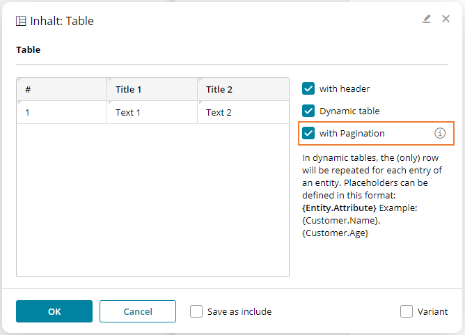
The data to be rendered via pagination can finally be displayed with the table content element. For this, a content element with the element part table should be extended by the attribute data-bsi-show-pagination-field. The following is an example of a possible table template:
<div data-bsi-element="table" data-bsi-element-part="table" data-bsi-show-pagination-field="">
    <table>
        <tr>
            <th>#</th>
            <th>Title 1</th>
            <th>Title 2</th>
            <th>Title 3</th>
        </tr>
        <tr>
            <td>1</td>
            <td>Text 1</td>
            <td>Text 2</td>
            <td>Text 3</td>
        </tr>
        <tr>
            <td>2</td>
            <td>Text 1</td>
            <td>Text 2</td>
            <td>Text 3</td>
        </tr>
    </table>
</div>
If the attribute data-bsi-show-pagination-field is set, the checkbox with Pagination will be displayed in the configuration of the table content element. In order to use pagination, the checkbox should be activated.
Limitations
There are some limitations to pagination:
-
Pagination has only been implemented for tables (i.e. the element part
table). -
The pagination can only be used directly in a website. We do not support the embedding of such a table in an include. Other content (for example for landing pages) is also not supported.
-
To enable a meaningful display of the handlebars code in the website editor, the Handlebars templates are rendered when the editor is initially loaded. Afterwards, the rendering happens only exceptionally. This can lead to the display being incorrect if page-dependent elements (such as {{navigation.activePage}}) are used in the template.
Metadata / Images for the navigation
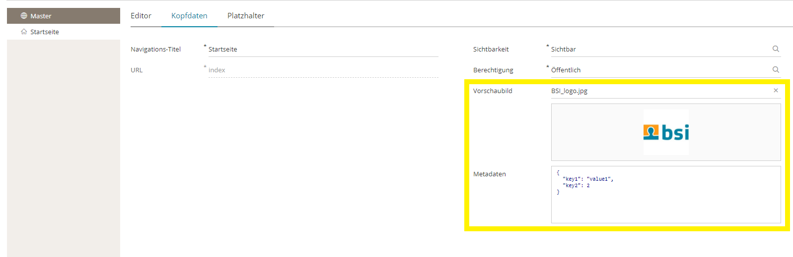
Each page and each folder of a website can have JSON metadata and an image to describe the navigation. These two elements are special, because they can only be edited programmatically and within a project-specific step. A possible use case is a REST webservice, which is embedded to the design through javascript. The project-specific step can return the image and the metadata on a GET request. This allows the rendered website to give images and information to the navigation.
These two attributes are invisible per default. However, they can be enabled through the BSI CX setting Website-Editor. Both attributes are the same for every language, so it’s not possible to deposit different images for a German and an English website.
Security - Google reCAPTCHA
It’s highly advised to use the Google reCAPTCHA service "I’m not a robot", when using username/password authentication with non-internal users (public). For that we use the optional BSI CX module com.bsiag.studio.media.googlerecaptcha, which can be configured in the BSI CX settings.
Example for including the dependency in the BSI CX app and the dev pom.xml:
    <!-- google reCAPTCHA service for website step -->
    <dependency>
      <groupId>com.bsiag.studio</groupId>
      <artifactId>com.bsiag.studio.media.googlerecaptcha</artifactId>
    </dependency>
A script can be included on the website’s design.html:
<script src="https://www.google.com/recaptcha/enterprise.js" async defer></script>The captcha-field can be added to a login form content element as follows:
<form ... data-bsi-element="login-form">
<!-- Content Element: Google reCAPTCHGA Enterprise -->
<div data-bsi-element-part="form-field" class="form-field-container form-field">
  <label data-bsi-remove-if="live">{{bsi.nls "captcha"}}</label>
  <input data-bsi-remove-if="live" type="text" data-bsi-form-field-type="captcha" value="Google reCAPTCHA" id="g-recaptcha-response" name="g-recaptcha-response">
  <div class="g-recaptcha" data-sitekey="the site key from the google api recaptcha registration" data-action="login">
  </div>
</div>
The label text can be added to the design.json as follows:
    "captcha": {
      "*": "Captcha",
      "de": "Captcha"
    },
After that, the field ID of the captcha field (on the website, that uses the design, simply open the edit dialogue and scroll down to the captcha field ID) has to be set to g-recaptcha-response. This value has to match the settings of the Google reCAPTCHA in the administration view.
The last step is to generate a reCAPTCHA key on the Google Cloud of the customer/company and register it in the settings under Administration - Customer Experience - Settings - Google reCAPTCHA Settings.
For local testing, the URL of the BSI CX website can’t be localhost. For this purpose, the local domain bsiag.local may be used. Simply go to the administration view - CX - Settings under base URL for public links and register a second path, e.g. bsiw0160:
{
  "_type": "start.BaseUrlSetting",
  "default": false,
  "inboundBaseUrl": "http://bsiw0160.bsiag.local:8085/inbound/default",
  "qualifier": "default",
  "resourceBaseUrl": "http://bsiw0160.bsiag.local:8085/dev/resources"
}
Then select this URL on the smart field base path on the website step.
Here is an approximate guide for the creation of a reCAPTCHA site on the example of BSI (customers have to adapt it to their company):
-
Create project: BSI CX - Website Step → projectId=bsi-cx-website-step
-
Add the service
reCAPTCHA Enterprise APIto the project -
Create login/access data for that api by creating a service account
Service account for bsi cxwith rolerecaptcha enterprise agent→ serviceAccountId=service-account-for-bsi-cx -
Add access key (json file) for that agent service account in IAM section of Google Cloud → credentials json file
-
Create reCAPTCHA site key here (this is just an example)
-
Add domains bsi-software.com and bsiag.local to site → recaptchaSiteKey=6Lcxp-…._lWrq
Documentation:
Creation of websites from existing landingpage templates
The following steps are necessary to create a website template from an existing landingpage template:
-
For navigation inside the website, the navigation has to be created inside an include.
-
Includes for the header- and footer-area have to be defined inside the
design.jsonfile. Furthermore, the Page-Include has to be defined. That area contains the proper content of the website. -
For landingpages images and other resources of the design can be referenced with relative paths. Because the base URL of a website points to the location of the website and not to the design, the handlebars template
{{designBaseUrl}}needs to be put in front of every design resource URL. For example,"img/my-image.jpg"has to be converted to"{{designBaseUrl}}/img/my-image.jpg". The handlebars template is replaced with the design’s correct URL by the BSI CX server on runtime.
Teasers
Teasers are personalized data tailored by BSI CX. An external system can request teaser data via EIP. The response is a JSON object which contains personalized text, images and callback URLs to BSI CX. The external system renders the JSON data into HTML and uses existing tools and libraries in that specific web frontend.
However, teasers can also be used internally in BSI CX, for instance in landingpages, in e-mails and in websites. For that BSI CX provides a special content element, which is rendered server- or client-side. Like the external system, BSI CX requests teaser data from EIP when the content element is rendered.
Depending on the use case, BSI CX design- and content authors can use either server- or client-side rendering:
-
E-mail: only server-side rendering is possible
-
Landingpages: server- or client-side rendering
-
Websites: server- or client-side rendering
Server-side Rendering
The BSI CX design must provide a teaser content element, based on a Handlebars template.
Here is an example for a teaser content element (teaser.hbs):
{{#if numTeasers}}<div class="teaser-display" data-bsi-element="teaser-display"
     data-bsi-teaser-rendering="{{teaserRendering.value}}"
     data-bsi-teaser-target="{{teaserTarget.value}}">
    <img src="{{teasers.[0].imageUrl}}" alt="" class="teaser-image-url">
    <div class="teaser-text">{{{teasers.[0].text}}}</div>
    <a href="{{teasers.[0].ctaUrl}}" class="button cc-jumbo-button w-inline-block teaser-cta-url">
        <div class="teaser-cta-text">{{teasers.[0].ctaText}}</div>
    </a>
</div>{{/if}}
Here is an example for the context file for the teaser content element (teaser-context.json):
{
  "teaserTarget": {
    "value": "Standard"
  },
  "teaserRendering": {
    "value": "server-side"
  },
  "numTeasers": 1,
  "teasers": [
    {
      "imageUrl": "{{designBaseUrl}}/img/placeholder.svg",
      "text": "Lorem ipsum dolor sit amet.",
      "ctaUrl": "#",
      "ctaText": "Dolore Magna"
    }
  ]
}
The following properties in the JSON are mandatory:
-
numTeasers: a teaser request may return 0 to n teasers. Check this value to control, whether the teaser should appear in the DOM. The BSI CX framework sets this value to 0 if the current participant is not a CRM customer, or EIP returned no teasers for the current participant.
-
teasers: an array of teasers, ordered by priority. Note that the teaser data is not fixed and depends on the content configuration. See the chapter about the JSON design to understand how the teaser data is configured in BSI CX. Usually you build a specific to teaser content element to render a fixed set of teaser data properties. The property names form the contract between the BSI CX content configuration for the teaser, and the Handlebars code in the content element.
You must set these properties in the context JSON, in order to render a proper preview in the BSI CX content editor. All other properties in the context JSON are regular properties required for the Handlebars feature. In this example the design defines two fields 'teaserTarget' and 'teaserRendering' for this content element.
The following data BSI attributes, can be used for teaser content elements:
-
data-bsi-teaser-renderingcontrols whether the content element is rendered by the BSI CX server. If the value is set toserver-side, fixed in the template or by the content editor, the BSI CX framework will load the Handlebars template for this content element, request the teaser data from EIP, will render the Handlebars template into HTML and replace the content element in the DOM. -
data-bsi-teaser-targetthis value is set either fixed in the template or by the content editor. Valid teaser targets are configured in the BSI CX settings. In the content you can specify a target for the teaser content element. This target is added to the request when BSI CX requests a teaser from EIP. Example value:Standard.
Client-side Rendering
If the value for the attribute data-bsi-teaser-rendering is set to client-side the HTML remains untouched by the BSI CX backend.
However, the attribute data-bsi-teaser-endpoint will be added to the DOM.
The attribute value provides an absolute URL to make a REST call from the web frontend to the EIP system.
If your BSI CX design must support client-side rendering, you need to add some JavaScript code to your design. A simple example implementation can look like this:
/**
 * Initializes the teasers in the document. This method is a blueprint for other frontend implementations,
 * not only in BSI CX designs, but also in external CMS or websites. Here, the endpoint URL is provided by
 * the BSI CX backend. The URL consists of these 3 parts:
 *
 * 1. The EIP host and path to the interface
 * 2. The teaser target (e.g. 'Standard')
 * 3. The teaser user ID (typically a UUID)
 *
 * Example: https://eip.bsi-software-com/web-api/get-teaser/Standard/1234567890
 */
function initTeasers() {
  let $elements = document.querySelector('[data-bsi-teaser-endpoint]');
  if (!$elements) {
    return; // Skip. There are no teasers to handle.
  }

  Array.of($elements).forEach($e => {
    let teaserEndpoint = $e.getAttribute('data-bsi-teaser-endpoint');
    if (!teaserEndpoint) {
      console.log('Teaser endpoint attribute is empty -> Skip teaser request, hide teaser content element.');
      $e.classList.add("w-hidden");
      return;
    }
    console.log('Request teaser. Endpoint:', teaserEndpoint);
    fetch(teaserEndpoint)
        .then(response => {
          response.json().then(response => {
            console.log('REST response for teaser:', response);
            if (!Array.isArray(response)) {
              throw new Error('Expected an array as teaser response');
            }
            let numTeasers = response.length;
            if (!numTeasers) {
              throw new Error('Teaser response is empty');
            }
            console.log('Teaser response contains ' + numTeasers + ' teaser elements. Using first element...');
            let teaser = response[0];
            $e.querySelector('.teaser-text').innerHTML = teaser.text;
            $e.querySelector('.teaser-image-url').setAttribute('src', teaser.imageUrl);
            $e.querySelector('.teaser-cta-text').innerText = teaser.ctaText;
            $e.querySelector('.teaser-cta-url').setAttribute('href', teaser.ctaUrl);
          });
        })
        .catch(reason => {
          console.error('REST request for teaser failed', reason);
        });
  });
}
This function manipulates the DOM to apply the values from the teaser data request.
See the code snippet for the teaser.hbs above, to understand how the HTML looks like for this example.
Also note that some properties values can contain HTML, to avoid security issues, you should always sanitize the HTML before adding it to the DOM.
When the BSI CX backend detects, that it is not possible to request teaser data, for the current participant in BSI CX,
the attribute data-bsi-teaser-endpoint will be empty.
This can happen, if the participant is not a CRM customer.
In that case the design author should skip the REST request and hide the teaser content element, or show a generic placeholder instead.
The JSON Design / Teaser Content Type
You have already learned that teasers are basically JSON data. This means a content author must configure JSON data for a teaser, as he or she would do with HTML content. In order to do that, BSI CX defines the content type 'Teaser'.
BSI CX comes with a special built-in design for this content type. Basically this design type works as a regular HTML based design. BSI CX uses the regular content editor to work with teaser content. However, although we work with HTML content in the content editor, this content is later transformed to JSON data by the BSI CX framework.
In order to do that, the content elements in the JSON design must use the following data BSI attributes:
-
data-bsi-json-propertyDefines the JSON property name. By default, the value for the property name is extracted from the body of the DOM element where this attribute is defined. -
data-bsi-json-value-attributeOptional attribute used in case, where the value is not stored in the body of the DOM element, but must be extracted from an attribute. See Example 2 below.
<div class="content-element-wrap" data-bsi-element="plain-text">
  <div class="json-property">{{jsonProperty.value}}</div>
  <div class="paragraph-light" data-bsi-json-property="{{jsonProperty.value}}">{{value.value}}</div>
</div>
Example 1: a simple plain text content element for the JSON editor. The content user can freely define a property name in the content editor.
<div class="detail-image-container" data-bsi-element="image">
<div class="json-property">{{jsonProperty.value}}</div>
<img src="{{image.srcUrl}}" width="920" alt="" class="detail-image"
    data-bsi-json-property="{{jsonProperty.value}}" data-bsi-json-value-attribute="src">
</div>
Example 2: an image element for the JSON editor. The content user can freely define a property name in the content editor.
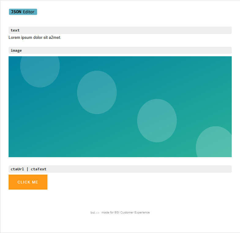
Note, the DIV with the class "json-property" is just eye candy to visualize the property name in the content editor (see the image below).
As in a regular design, you can use existing element parts to build your JSON content elements, like the image element part, for choosing images from the BSI CX media library.
You can also build JSON content elements that emit multiple json properties, like a CTA button that emits a ctaText and a ctaUrl.
With that you can provide a reasonable content preview to the content user, although he or she configures just JSON data. This is how the JSON design looks like in the content editor:
Fixed JSON Designs
For rapid prototyping it is very convenient to have a flexible JSON design, which allows to define arbitrary property names.
However, in a real-life project you want to fix property names, because they are the contract between the BSI CX content, the teaser data stored in EIP, the design which must render that data or even an external third party system, which must render teaser data.
For that purpose the BSI CX design developer can make a fixed JSON design. In that design all property names are pre-defined, and they can not be changed by the content author. It is also not possible to add additional content elements or remove existing content elements. All this is achieved by using the existing BSI CX design features, like hiding copy and remove buttons in the content editor or limiting the number of content elements in a dropzone. In comparison to the examples above a fixed plain text element can look like this:
<div class="content-element-wrap" data-bsi-element="plain-text">
  <div class="json-property">plainText</div>
  <div class="paragraph-light" data-bsi-json-property="plainText">{{value.value}}</div>
</div>
Example 3: a plain text content element for the JSON editor. The property name is fixed (plainText) and can not be changed by the content user.