Introduction
Create experiences that delight customers. For marketing, sales, and service: Find, win, retain, and understand customers with BSI CX. Design, execute and optimize perfect customer journeys. Everything is cross-departmental, individualized for every customer, in real time, across all touchpoints, and fully automated – for extraordinary and emotional experiences.
Learn more about all features of BSI CX by visiting our product website.
| You wan’t to build a BSI CX Design? Learn how to use BSI designs by taking part in the e-learning for designs! |
| BSI CX, Customer Experience and Studio. The BSI Customer Suite consists of multiple Products, BSI CX is one of it. Formerly called BSI Studio, CX is an abbreviation of BSI Customer Experience. |
Getting started
Learn how to use BSI designs by taking part in the e-learning for designs.
The interactive e-learning helps you to reach your goal faster. We have developed this e-learning from years of experience with various customers, with the aim of learning how to work with designs quickly and delivering good results to the customer in a timely manner. In particular, you will learn how to work with our templates so that you don’t have to start from scratch.
We recommend to start by adopting an existing design for BSI CX. This will help you to get started and will already come with existing content elements which act as examples for your customizations. BSI provides a set of design templates that are called Master Templates. The Master Templates for email and web (including landingpage and website) are publicly available on GitHub as an MIT licensed open source project. The current design zip files for uploading to BSI CX are available for download in the GitHub releases of the respective Master Templates.
Besides, the design build which is used to build the templates, as well as the library for email content elements and web content elements on which the templates are based, are MIT licensed open source projects.
Technical Introduction
This documentation acts as the primary resource for developers that wish to implement a design for BSI CX. For implementation of designs for BSI CX 22.0 and later.
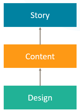
Designs are a vital part of BSI CX. While focusing on BSI CX Designs, a basic knowledge of the following layers is necessary:
- Story
-
The Story controls the flow of a participant. It offers various steps which can be placed on the storyboard via drag and drop. Your next customer journey delivering a landing page, event invitation, website or newsletter will be born here.
- Content
-
Websites, landing pages and newsletters require rich content. The content editor of BSI CX is here to configure such contents. By user using Content Elements – reusable building blocks that can be placed in your content via drag and drop – you can build attractive newsletters, innovative landing pages and feature rich websites.
- Design
-
The foundation of every Content is its design. The design defines the available „Content Elements“, the visual representation of the content and the behavior of the content and content elements. The Design must be created externally and uploaded into BSI CX. This documentation covers how to build such designs.
Branding & Visual Design
Each brand has its own and unique visual design language. The branding guidelines of your company or customer define the boundary conditions for building a design. As a design developer for BSI CX, it is your responsibility to get a specification on how the website, landing page or newsletter should look like and what elements it should consist of. Especially when it comes to designing HTML emails, you may have to find a compromise between the developers' ideas of visual design and the actual technical possibilities of HTML emails.
Constraints
| Our build and the BSI CX-Editor has to be taken "as-is". |
If the Design Validation fails or the Editor doesn’t show the Elements properly, it’s the responsibility of the developer (probably you) to adjust the template accordingly.
There are some web technologies we do NOT support. Two common examples are:
-
Webcomponents might work in the resulting landingpages, but are not supported within the BSI CX editor.
-
Other Frameworks like Angular or React are familiar to most web developers, but not supported by BSI CX.
We strongly recommend you to use our npm build. Feel free to contact the design team, if you miss a feature or have an improvement idea.
We recommend to start by adopting an existing design for BSI CX. This will help you to get started and will already come with existing content elements which act as examples for your customizations. BSI provides a set of design templates that are called Master Templates. The Master Templates for email and web (including landingpage and website) are publicly available on GitHub as an MIT licensed open source project.
File format
| Please refer to version 16.3 of the BSI CX design documentation for file format up to BSI CX version 16.3. |
A BSI CX design is stored in a ZIP archive. A valid design for BSI CX since version 22.0 must contain the following mandatory files:
- design.html
-
Defines the design, particularly the dropzones the user can use in the BSI CX content editor to place content elements. The exact design.html syntax is described below. This file must be in the root of the ZIP file.
- design.json
-
Contains metadata on the design, such as names and descriptions of the content elements and groups. The exact design.json syntax is described in chapter [designjson]. This file must be in the root of the ZIP file.
Besides these two mandatory files your design will need some content elements. Typically, a folder named content-elements contains all content elements of the design as html files. These elements can later be drag and dropped into the dropzones of the design.html. A content element is an HTML snippet that does not require any Doctype, <html>, <head> or <body> tag.
Additional optional files and folders may be supplied in the ZIP file as well. Note that one ZIP file can only contain a single design.
| The files and folders in the ZIP file must not contain any umlauts. |
The following folder structure showcases the content of a simple design:
design.zip
│   design.html (1)
│   design.json (2)
│   preview.html (3)
│
├───content-elements  (4)
│       button.html
│       text.html
│
├───css
│       styles.min.css
│
├───img
│       logo.png
│
└───js
        3rd-party.min.js
scripts.min.js| 1 | The mandatory file design.html defines the base layout of the page/email. |
| 2 | The mandatory file design.json contains meta information about the design and its elements. |
| 3 | The optional file preview.html contains a preview of the base layout including some elements. |
| 4 | The content-elements folder holds all content elements html files. |
Using Handlebars Elements
Starting BSI CX 25.1 a new Schema-Version of the design.json file is allowed: 25.1. This schema version enables handlebars content elements.
Handlebars is a templating engine that decouples the user input in the content element editor from the concrete DOM structure that is rendered into the BSI CX content.
Since Handlebars templates always need an object supplying the variables for rendering (in our case as a JSON-document), the structure of the design ZIP changes slightly.
- design.hbs
-
Instead of a
design.htmla handlebars template can be supplied. It will be preprocessed (rendered) before being loaded into the content editor. - design-context.json
-
This JSON-document supplies the variables used to render
design.hbs. In the case of websites this file can be omitted, since in the context of BSI CX websites, the context is supplied on include-level.
design.zip
│   design.hbs (1)
│   design-context.json (2)
│   design.json
│   preview.html
│
├───content-elements
│       button.html
│       text.html
│
├───css
│       styles.min.css
│
├───img
│       logo.png
│
└───js
        3rd-party.min.js
scripts.min.js| 1 | The file design.hbs supplants the formerly used design.html. |
| 2 | Once Handlebars content elements are being used in design.hbs, the design-context.json file becomes mandatory. |
Content Editor
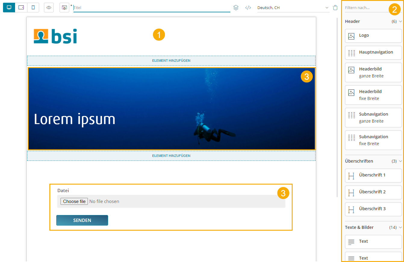
The content editor is where specific websites, newsletters and landing pages are created. The content creator relies on a design of good quality to build contents which on the other hand are referred from a story.
-
Design preview in content editor
-
List of available content elements
-
Use of a customizable content element
Content Security Policy (CSP)
If a design requires resources from external servers, e.g. from a Content Delivery Network (CDN), two settings must be checked in the BSI Customer Suite and, if necessary, adjusted according to the needs of the design. The settings can be configured by a user with the appropriate permissions in the BSI Customer Suite administration.
| Observe the notes on the integration of CSS and scripts in chapter [Control Attributes]. |
HTTP headers for public links
The HTTP headers including CSP settings for BSI CX landing pages and websites are configured here. These are relevant for displaying the landing pages and websites in the end user’s browser.
Content editor
The BSI CX content editor has CSP settings distinct from the rest of the BSI Customer Suite. They can be configured in the general content editor setting under cspDirectives.
These directives should be configured more restrictively than the setting for landing pages and websites above. Only what is absolutely necessary for error-free display in the content editor should be allowed. As a rule, styles and fonts are allowed, but not JavaScript.
Structure Reference
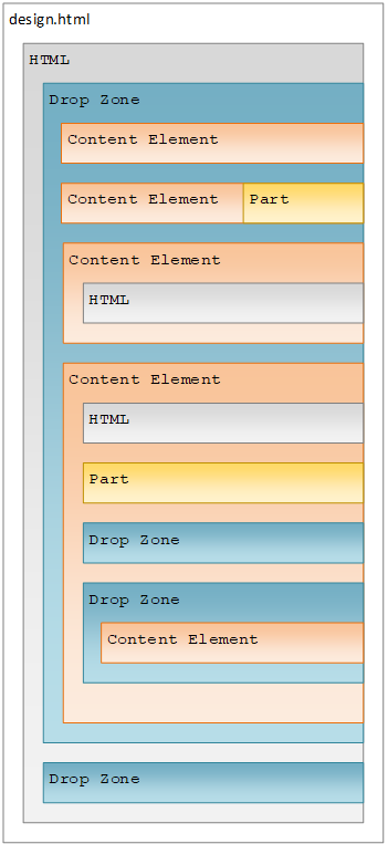
The file design.html contains the frame of the design and must include at least one outermost dropzone.
It must contain valid, XHTML conform HTML with Doctype, <html>, <head> and <body> tags.
The individual content elements are HTML snippets that are inserted into the content using drag & drop.
Dropzones
While dragging a content element into the content area, you will notice blue lines and blue areas. These areas are called dropzones and identify areas where certain content elements can be placed. Each dropzone has a list of allowed content elements that are specified in the design.
A dropzone is defined by adding the attribute data-bsi-dropzone to an HTML container element (e.g. <div> or <table>).
The list of allowed content elements is specified by the data-bsi-dropzone-allowed-elements attribute.
An optional limit of elements that can be placed inside the dropzone is defined by adding the data-bsi-dropzone-max-number-of-elements attribute.
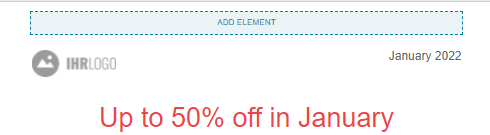
<div data-bsi-dropzone="preheader-zone" data-bsi-dropzone-allowed-elements="nl-preheader" data-bsi-dropzone-max-number-of-elements="1">
    <!-- Add element -->
</div>| Problems can occur when placing a dropzone into a button element. In this case, we recommend using a style. |
Groups
|
All content elements can be structured in groups.
In the example screenshot on the left side, three groups are defined: |